To begin with our methodology unit, we need to pursue many different creative ideas and avenues, to broaden our working methodology and overall quality of work.
Therefore towards at least the beginning of this unit, this blog may have somewhat erratic and unlinked research as I shall be pursuing several ideas at once.
First Idea, Beginning with Folklore...
I've had a general interest in old English folklore for some time now but never fully delved into it. We have a rich heritage in folklore, and our dates back way before the birth of Christ, but we are taught, and I know little about our root heritage, the old ways, and the origins of our customs and traditions. small amounts of this heritage drip through in our customs and festivals, such as Halloween, or Morris dancing, however there are merely drips and drabs, even when speaking with many Morris dancers over a long period of time, even they do not really know the background to their dances, festivals and the origins our English Heritage.
I have always been fascinated with fantasy, escapism into wondrous worlds where magic and monsters are commonplace, as I find them a most pleasing retreat from the banalities and troubles of the modern life. Many fantasy narratives, creatures and so on find their roots within our own countries folklore and old wives tales, and so I delve as far back as I can into our countries roots and customs.


Looking through these pages, they talk of the original Neolithic Britons old Druidic religion, that became known as Paganism with the Celts. I am most intrigued by the idea of multiple gods and spirits, and that every tribe had their own patron gods.


The book also talks of their sacred sites, the speculated meanings of stone arrangements, wells, barrows and spirit lines. They had many sacred sites and areas of intense spiritualism, where they believed they could in some way contact the spirit world, or at least that the boundaries between our realm and the spirit realm where weak here.
I was most intrigued by the origins of Halloween, that was, loosely translated, known as hallows eve. Paganism was a religion very much influenced by the seasons, particularly harvest seasons, and this shaped their calendar. At the time of Hallows Eve, they believed that this was a day (more the night of this date) when the boundaries between the spirit realm and the mortal realm where weakest, and so creatures of the spirit realm could spill into ours, or when we may be able to tread in their domain to contact the dead.
I next delved back into the library in search of less historic detail, and more on the beliefs and parables of ancient Britain, and for some more visual imagery on these old tales and beliefs as well, which brought me to a book on Faeries.

This book is more of a collection of parables and a 'bestiary' on different Faeries, sprites and spirits. Something I have learned so far, is that when the term Faery is used one must not think of 'fairies' such as the Tinkerbell of Peter Pan and so forth, a better relation one may make to them is to think of them as almost 'pre-Christianity angels and demons'.
I have scanned in pages I found of choice selection, for both their content but also for the visual imagery.


I find many of these pages absolutely fascinating, along with their imagery of doorways on rocks, islands that only emerge once every seven years, and the underworld kingdom under Glastonbury Tor.
I very much like the idea of creating a body of work that shows these moments where a spirit, or faery drifts the border into our world, or a hidden passage is found from our to theirs.
I want to find a way of showing these Faeries through photography, however I do not want to show images that seem childlike, and I do not want misconceptions of these spirits that make them appear 'Disney'. However, neither do I want to try to completely contemporise them, they need some element of the past or the old to them.

I decided to delve into photographers that have created works that deal with either elements of some fantasy, or in this case the occult. This book is a collection of mainly Victorian photographers that attempted to photograph elements of the occult.


Obviously as documented, all of these images are tricks of lighting or double exposures etc. and all range from some rather impressive images, and the hilariously staged, all of which made with a strong undertone of eccentricity.
Many of these images give visual inspiration as to how I can portray these spirits of old, mainly the two pages above, one a double exposure of costume, and the other an experiment with light part way through the developing process.
More than that though, it has given me inspiration to the stylization of this project. I have become captivated with this Victorian era. They where an incredibly eccentric people, this photography of the occult book being one example. It was an era of eccentricity in general though, old cults being unearthed and restarted, the colonization of Egypt and the unearthing of the tombs and pyramids. It was an age of discovery and invention, quite a notable one to my project, the age of the novel. Writers like Mary Shelly, Edgar Allen Poe, and Bram Stoker, unearthed old folklore or beliefs, and turned them into something more. In some respects, particularly that of Bram Stoker, folklore has been completely reshaped, and given the modern world many misconceptions about our history and tales of old in regards to lore on Vampires.
So I want to take an element of style from the Victorian era to this, as it is an unearthing of ancient routes and traditions I want to give it that eccentricity of the Victorian era.
Test Shoot
I took a Victorian suit, with a slightly more contemporary hat, I decided upon creating a 'hollow man' idea, as I said I did not want childish or 'Disney' appearing images so I couldn't go too literal with the modern idea of what a Faery should look like. I thought of different ways to create this Faery, that made him seem almost playful and inviting, like the images of the Faery kingdom under Glastonbury Tor. So I decided upon a masquerade mask along with the Victorian suit, this gave him 'eyes and a face' in a way so that he did not appear quite so empty and characterless.
I achieved this by shooting myself first in the clothing.

Then I shot the background with the camera, focus and lighting all left as they where.

Then, again under the same conditions, I photographed the hat.

And finally using masking tape and pipe cleaners I propped the cuffs and collar of the shirt up and photographed those too.


Using this method, I was able to photograph myself, then rub out all of myself, face, hair, eyes, wrists etc. and then I could fill in the blanks by compositing the rest of the clothing and backdrop.

First Shoot
Using the same methods as my test, I took the same outfit, asked a friend to model and went out on location, using a Hasselblad H4 and a Bronica Mobil studio kit, I found an old church and graveyard with no signs of modern technology present in frame.
This was my finished product:

I was very pleased with the lighting on location, however upon reflection, I want to avoid graveyards or churches with this project, as they give religious connotations, or least the notion of the 'dead' rather than spirits or faeries. I would like to continue this shoot further and push for the best way to show my spirit world from a forgotten heritage. I would also like to explore the masquerade mask in more depth. As this mask becomes my faeries' face, and gives them much of their personality, so I would like to explore the characters I can create with a whole variety of these masks.
Self Portraiture
As this is the early stages of my methodology, I am going to be pursuing multiple photographic ideas at once, trying out new things, styles etc. Some may get dropped completely, some may influence others, and ultimately some will merge into my finished product.
So to divert from the subject of Folklore, I am looking at some self portraiture, as we are constantly being poked and prodded by our tutors asking "what kind of photographer are you?" "what kind of photography is this?", I find with my work, I dislike this idea of labelling or pigeon holing both myself and my work, as once someone stamps a label on something, that thing then assumes all the weight of pre conceived judgements, stereotypes or conventions of that label. Both my own style of photography, and the works I create, I create without labels or specific styles in mind, I simply follow a creative discourse along a certain subject or visual style I am currently intrigued by, and I believe this to be my best course of workflow, and this is because as soon as one says 'landscape photography' or 'portraiture', your mind closes to only that subject, and this is counter creative, as inspiration comes from all avenues, and it is important to have a freedom of constraint when creating art works.
As we are constantly being asked what kind of photographer we are, I decided that where I would not try to pinpoint myself to one style, being constantly asked this question has provoked me to explore myself more, and so I wish to look at some alternate forms portraiture, to try and find a way of displaying some of my personality, or desires through photography.
I have begun with a book called 'Ghost in the Shell, Photography and the human soul'. The book is a collation of photographs on portraiture from 1850-2000, and a series of articles, exploring different methods of portrait photography, and the struggle to capture the 'true self' through a photograph.
I have scanned in choice pages for their method of portraiture.


Looking at some of these portraits, I am quite moved by the alternate takes on ways to show a persons 'true self''. I still however believe that attempting to portray myself truthfully in one photograph, is a fool hardy attempt, as one simple action or expression cannot eloquently show an entire persons personality, or define what makes them, 'them'. There are many beautiful portraits that show much of what a person is, or make an eloquent enough attempt, but I find that what it is that defines us, is a rather abstract and undefinable ideal. So I am going to attempt a series of rather abstract portraits, that can merely tell parts of myself; characteristics, habits, etc.
I have started with four photographs, experimenting with long exposures, using the camera to 'record' actions that are something of a banality however actions that I constantly do, banal as they are, they are a part of me that is definable, if not unique.


It is an obvious aspect of the 21st, however, I spend, from an objective point of view, ridiculously large amounts of the day in front of my laptop, or more specifically on the internet. Be it typical aspects such as procrastinating on Facebook, or looking at funny images or gaming, to researching, and writing this very blog, I spend the majority of my waking hours drifting through cyberspace.


Opposed to my time spent glued to the screen, I devote a large amount of time and attention to my motorbike. It is not only a passion but it is also my only means of transport, therefore both out of necessity and choice, my motorbike has become very much a part of me. It causes the act of going outside to become somewhat ritual, regardless of the length or purpose of the journey, both the start and end include the ritual of preparing to leave one space and enter the next, through putting on all of my protective gear.
I started with these two aspects of myself, as they are both undeniable banalities, but they are integral parts of me, even more so because they are a consistent day to day repetition. They are also the two things I do most often, and are quite opposed to one another as actions. One being lost in cyberspace, retreating away from reality, and secluding myself away from a natural environment, and the other being a choice of complete exposure to outside world and it's elements. I feel this is quite important as the more I attempt to internally deconstruct myself, the more I realise much of my personality opposes itself, and that I am a very conflicted individual.
Taking these ideas from my self portraits, I wanted to take this to other people and looking at other aspects of peoples lives, maybe looking again at that idea of the mundane, the banal day to day routines we all have as if we simply go through the motions.


I decided to look at people in their natural spaces next, pulling out from the person, as their banal routines are part of the spaces in which they live and what they do in them.
I went to a friends house, and decided to look into his act of smoking, as his garden is rarely used other than this small patio section where he smokes, the garden simply becomes a vessel to facilitate this habit or indulgence away from the space in which he lives.
I began shooting with a long exposure combined with a metz flash, which to an extent worked, but only in my mind as it got darker, so that we could get more distortion or ghosting in him, then for the last shot, I merely exposed for 30 seconds or so as he finished his cigarette and left the space. the shot with flash of him smoking works but more when used in conjunction with the next shot of him leaving.
After trying the longer exposure using just the artificial lighting that occupied the space, I preferred both the image and concept to this method of shooting. So I next looked into their inner space away from his outside retreat, and to his interior living room. As my friends work quite a few hours in their jobs and at odd shifts, their time and relaxation away from work has to happen at odd hours whenever it can, where they spend much time simply watching television or gaming to pass the time till the next shift. Taking the ideas from the smoking shots I then used the light of the televisions in the room as they sat next to one another with two separate televisions focused on two separate things, which creates an odd social situation that I decided to utilize.


Taking this method I turned it next to myself, as shooting or social situations often mean when I do return to my home, it is often quite late, and I merely return to rest my head.

Critical Perspective Research
Now, my methodology and critical perspectives essay are two separate projects, however the idea is that they should link in some ways, and as I am pursuing multiple photographic avenues, I have found one of which I wish to pursue with my essay, as well as photographically, and that is the 'cyberpunk' sub culture, that is very much integrated into our society, though many are unfamiliar with the term.
To begin with, what is cyberpunk?
Cyberpunk is a postmodern science fiction genre, noted for it's focus on "high tech and low life". It features advanced science, such as information technology and cybernetics, coupled with a degree of breakdown or radical change in social order.
Cyberpunk plots often center on a conflict among hackers, artificial intelligences, and megacorporations, and tend to be set in a near-future Earth.
The settings are usually post-industrial dystopias but tend to be marked by extraordinary cultural ferment and the use of technology in ways never anticipated by its creators, "the street finds its own uses for things". Much of the genre's atmosphere echoes film noir, and written works in the genre often use techniques from detective fiction.
"classic cyberpunk characters were marginalized, alienated loners who lived on the edge of society in generally dystopic future where daily life was impacted by rapid technological change, an ubiquitous datasphere of computerised information, and invasive modification of the human body. (Lawrence Person)
A key part of the cyberpunk sub genre, that pulls me towards it, is that they're typically set within Dystopian societies. The Dystopia being the binary opposite of 'Utopia', dystopian societies can be very much viewed as an 'enhanced' or 'dramatised' version of our current western society.
A quintessential example of this visually, is Ridley Scott's Blade Runner, as it is layered in such a way that almost any mere still of the film, captivates the ideals of the cyberpunk in a complex visual layering, particularly scenes of the city streets.
I have taken a choice number of screenshots, that merely visually captivate me the most.

I am very much captivated by this image of the eye. It is a stunning overlay, showing the great industrious landscape through the reflection of the eye, it makes somewhat a spectacle of itself. It is mainly for the visual reinforcement in this, especially to those familiar to the film and it's emphasis on sight, as the quote from replicant Roy Batty echoes in my mind whenever I see this still, "If only you could see what I've seen through your eyes."


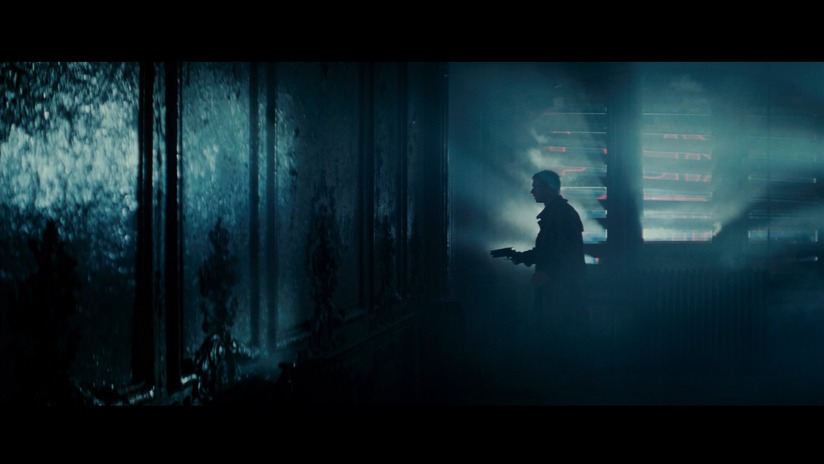


There is an 'other world' feel to all of these stills to me, that I think its what draws me so much to film, as well as it's narrative and conventions. The above quote of cyberpunk protagonists being "classic cyberpunk characters were marginalized, alienated loners who lived on the edge of society in generally dystopic future where daily life was impacted by rapid technological change" could not be better shown visually than some of the above stills, particularly to me the following 3:
These fantastic and clustered backdrop and scenes, so unusual and detailed sublime settings, completely devoid of any form of nature, the film is set almost entirely at night, so even the natural sunlight is barely present. The human element as well in each frame is important, as it is so contrasting to it's backdrop to our eyes, particularly the last frame, that shows this fantastic sci-fi city shot, lit up by all the lights of the night, however, the casual and natural element of Harrison Ford, wrapped in a blanket of a cold night with a drink, overlooking his balcony with a whiskey, throws your perception off almost, as it 'humbles' this epic night view of the city, and forces the viewer to acknowledge this city as the natural setting, the banal almost.
The characters fit perfectly in their settings in each above still as well, for being, the marginalised, the alienated, individuals that the genre is all about. This idea to cyberpunk characters as the alienated, the marginalised, and those on the fringes of society, could arguably have been a direct take on social structure in the modern age.
An essay from as far back as 1903 from Georg Simmel titled "The Metropolis and Mental Life", points out many conflictions within the city, that are not entirely good nor bad. He speaks of the city as a sensation and kaleidoscopic variety, and this creates an intensification of emotional life. The sheer number of people and the wave of internationalism, the economic imperatives, the business and money driven intensity can flatten the distinctions between people and objects. It can be easy to get lost and be absorbed by the intensities of the metropolis, but one can also be made anew.
So looking back to as early as the first formings of the metropolis, philosophers like Georg Simmel where already making links and highlighting these social issue and conflictions that cyberpunk uses as it's basis, and this was way before things like the 'mega-corporation' or 'digital-age' where around.
In short, I am drawn to Blade Runner and the cyberpunk, both visually and conceptually, as it highlights many social concerns and issues that we arguably, are living through right now, even some of the cities of the modern world are very much the literal vision of Blade Runner, looking at Tokyo or Dubai.


Her images are deceptively difficult to create, but in essence she is using very long exposures at night in order to capture the city using the artificial lights darted around in every nook and cranny around a city, essentially creating an 'otherworld'.
Another photographer to look at the night time as something other worldly is Dan Holdsworth, particularly with his 'A Machine for Living', and his shots of Bluewater shopping centre at night.


Again using very long exposures, he draws this unnatural light across the landscape, he utilises highly saturated colours, to draw out the unnatural even from the foliage, so that none of it really looks 'real', instead the scene is incredibly unneasy and eerie. The name for the series, originates from his concept behind this series, that something like the busy shopping centre of Bluewater, is filled with such inner workings and constant artificial light, that it takes on a living presence, that it is not a machine for which we use to live, but rather a living machine itself.
He favours the psychological aspects of the landscape rather than the landmarks or location, particularly in this instance, he depicts Bluewater, as this eerie almost sci-fi landing platform, surrounding by this surreal post-apocalyptic esque landscape.
I decided to go and experiment with some long exposures myself, and try to pick elements of this 'future' or sci-fi depiction of a world that we do actually live in, looking at the building as the monolith, and this alien like night time structures that in appearance reject that what is natural.
I went to the Dockside shopping centre in Chatham, to try to capture some newly designed towering high end appartments, but also as it is a sight of an old dockyard, it has some routed remnants of the past in surrounding architecture, it very much suits the 'retro-fitting' architecture we see at the street level of Blade Runner.


I really liked this idea of layering, because of the density of the architecture of Blade Runner, and again the idea of 'retro-fitting' the new on top of the old, as that is a natural occurrence in our architecture that is progressing more and more. I found this abandoned cage of girders, that was to be a new assembly hanger for boats, that was long since abandoned that remains in the centre of this new shopping area and apartment blocks. So I photographed surrounding areas trying to look at the lights mostly, and this idea of layering, and I couldn't resist including the nearby duel carriage way as the street and car lights and really bring out this idea of the space age and wonder through long exposures, and contrast that with the dark looming apartments that should be a symbol a new wonderful living, but instead appears more a dark monolith. Also I couldn't help myself but to quickly pastiche that classic still of Blade Runner's opening, where the city is reflected in the eye.
Upon reflection of these images however as much as I like a few of them, and its a good start, it simply does not reflect the emotions and atmosphere of this gritty apathetic dystopia I see.
Looking at both Dan Holdsworth and Rut Blees, I went to bluewater shopping centre myself, to try some long exposures. I wanted to focus less on the larger landscape, and more narrow down sections and areas of the shopping centre, looking at as more of a pretense of utopia. As I am focusing on the cyberpunk and the dystopia, a recurring aspect in dystopian societies, is that they manifest themselves under pretense of 'utopia', trying to achieve perfection and lavish flawless lifestyles, but these occur mainly for the rich and select few, quoting the tagline for the cyberpunk genre 'high tech and low life'.


I prefer my shots around the car park areas from these, as they show a bit more of the grit of the dystopia, but they don't reflect it clear enough, and there is not enough idea of intimidation from these that you see in the city scapes of Blade Runner.
Reflecting upon past experimentation for this project, and the feel and concept of the apathetic dystopian society, I need to try and create a hybrid, from my self portraits and from my long exposures around dockside and Bluewater. I got a better sense of an eerie futuristic landscape from my Dockside and Bluewater shots, however I am more interested with the impact of a dystopia on a more social level, what it does to us as humans, what we become, and how it dehumanises us. So I really need to get back to the human element in these environments and landscapes.
After a bit of searching through photographers, I came across Alexey Titarenko, a Russian photographer, born in 1962. I was captivated by his body of work 'City of Shadows', which was a series of photographs taken around Saint Petersburg in the 1990's focusing on totalitarianism and the collapse of Soviet communism.


These images in particular around a subway station, show exactly what I wish from my project looking at the dystopia. He describes these particular photographs as:
“The mass of people flowing around the subway station formed a sort of human tide, giving me a sensation of unrealness, of phantasmagoria, These people were like shadows, one would meet in the Underworld. I decided to express that feeling in my work, to convey my personal expressions. I had to find a visual metaphor that would enable the viewer to share my feelings as acutely as possible. That is what prompted me to try a long exposure process.”
Looking at his usage of the long exposure and focusing on the crowds of human en-mass as one huge ghost like entity, I wish to try something similar of my own, adapting this style to fit with my project on the dystopia.
Location wise, I believe Bluewater, is still my best location, as it is built to look ultra modern, or futuristic, and it also is a fantastic representation of mans attempt at creating the utopia. As it is built as a center of luxury, with marble and carpeted floor, engravings on the marble walls, and the domed glass ceilings. It is also packed with nothing but consumerism, the high end fashion retailers, meet some high street fashion retailers, as Bluewater attempts to be a consumerist center catering to both the lower aspiring classes, and the upper crop of society. It symbolizes both mans, beguiled attempt to create a utopia, and also the delusional aspiring lower classes of society, that are lured into the dream of utopia.
I do not wish to mimic Alexey Titarenko's style however, and the usage of black and white I would not find entirely fitting here, as I wish to have a style the more reflects, 'the future in the now'. Therefore I wish to try this with colour photography, which, with the passing crowds and long exposures, should give me some very unusual colours, adding to this idea of the delusional, and surreal dystopian world.
Making my final Images
Due to the limitations of long exposures on Digital cameras, I have switched to shooting medium format on a Mamiya RZ, and I am aiming for at least 20minutes per exposures using a neutral density filter and as high an F stop as possible.
I gained permission to shoot within Bluewater, picking a saturday as it would be at it's busiest, so I could gain as much crowd movement as possible.
Unfortunately due to the length of the exposure times I need and the amount of moving crowds, there is no way to accurately measure the correct exposure, and from my first shoot, only 1 negative was correctly exposed.

(above) this was the raw scan of my negative

(above) post clean ups and colour balancing
The raw negative was completely discoloured due to the length of the exposure and the shift in lighting as the crowds moved. This unusual colour caste where colours seem to almost melt into one another as a collective works really well with my concept of the endless shifting crowds of empty vessels, and it adds to the mood of the image as something unsettling, and warped as if a drug, everything is out of sorts. However I wanted to restore at least some of the correct colours to my image, so that it was slightly more clear and definable as to what the audience is looking at.
Overall I am extremely pleased with the final result, however I have to of course, reshoot to gain more of these images, as I wish to have either 3 images to at least choose from, if not display all three.
For the title of this project, I am going to borrow a line from Rutger Hauer, and call it, "Tears in the Rain". Which is a line from the final soliloquy of character Roy Batty (played by Rutger Hauer) from Blade Runner. His final monologue states:
"I've seen things you people wouldn't believe. [laughs] Attack ships on fire off the shoulder of Orion. I watched c-beams glitter in the dark near the Tanhauser Gate. All of those moments will be lost in time, like, tears in rain. Time to die."
I have found for a long time, that this final scene in Blade Runner, has been one of the most moving things I have ever watched, and as the whole film and it's story has been such an influence on the creation of this project, it is only fitting that I pay tribute to the film in naming my project Tears in the Rain.
Artist's Statement first Draft
We live in a world of aspiration, driven by the golden carrot of a better life.
Our focus however strives towards just the one better, the material better, at the willing expense of the ethical, environmental, and social betters.
We are told to dream of the Utopia, and strive to achieve it. But as we dream this dream, we consume as a mass entity, in a beguiled attempt towards our Utopia. Yet as individuals, we are segregated, our individuality lost, in the sea of information of others, like tears in the rain.
Format of my work
For this piece, I would like to do larger scale prints, depending on the outcome of the shots I last took for this project, I would potentially like to use larger prints, most likely A2 or A1 prints, framed and mounted in a gallery, and if I choose to use my shot of Bluewater food court, I would have to go with that single print and make it a fairly large size print.
For my second shoot in Bluewater, I kept the camera more at the level of the people walking past, in an attempt to pull back some more of the style of my initial longer exposures of people. In this state, we would observe the 'ghosts' of the people more up close, but also the paths in which they've walked would be at a far more personal level with the viewer due the camera angle. I want a sense of scale however, these long exposures are long enough that film begins to degrade, the colours blend, and people or their paths become indistinguishable from one another, fitting with my concept of our dehumanization through mass consumption. As my concept needs to reflect us as people on more of a whole, my images to need to reflect this as well, therefore if I use my second set of images, that are at a more personal camera angle, I will use three images, in order to pull back a sense of the scale of us, as consumers. If I choose my food court image however, that is a camera angle far more impersonal, looking down on the subjects, and we can clearly see, a mass of people that are presented as 'soul less' or hollow, therefore, I believe that three images of that nature would more water down the effect, and that my food court image would be strongest if presented on it's own, however I would have it printed much larger it where on it's own, so that it's size allows people to spend lengths of time, studying each section, each individual 'husk'.
Due to the required size of my images so that they have the necessary impact, I would of course require them to be gallery pieces. As they deserve a study of more detail that simply published on a website or magazine.
Considering I have strong inspirations for this piece from the works of Dan Holdsworth and Alexey Titarenko, I want to first look at how they, and other similar artists, have chosen to print and mount their work.
Dan Holdsworth - A Machine for Living
In Dan Holdsworth's series, "A Machine for Living", both his concept and his location have obviously been such a huge influence on me, particularly with my location as where as I chose to go inside Bluewater, his take on what this shopping centre represents really inspired me. So I wish to take his print and mount method into account first.

Dan Holdsworth, A Machine for Living: Untitled 1999
© Dan Holdsworth
So looking at his print method for this series, he prints (roughly) an A0 size format, and mounts onto Aluminium.
Rut Blees Luxemburg
Rut Blees Luxemburg's series "A Modern Project" has also been very influential on my photographic style, as mood and overall atmosphere to her give this visualisation of an "otherworld" that exists within ours, and I really wanted an element of the "otherworldly" reflected in my project.
 | ||||

| |||
| |||
| |||
| |||
| |||
|
Similar to Dan Holdsworth, she uses Alumium mounting with C-type prints, and the images are again close to the A0 mark in size.
Depending on the space in which the print placed would alter my desired size, given a smaller room, or if placed in context with the work of others, A0 would be quite appropriate, as I wish for the image to be large enough that people are drawn in, and wish to study the finer details, however if my image is too large people may be more tempted to simply stand back, and glance at the piece. Therefore I am a little flexible on my desired output size.
In terms of his works, Andreas Gursky has not influenced my work in a conceptual or visual sense, however viewing his prints, they definitely showcase the impact that a large, high quality print can make.

Andreas Gursky, Chicago, Board of Trade II 1999
© Courtesy Monika Sprueth Galerie, Koeln / VG Bild-Kunst, Bonn and DACS, London 2005
His images varying in size but generally gravitating around 3 metres wide and 1.5 metres tall, his prints being framed, with a semi gloss texture to the paper and glass fronts, to give a more vivid colour range whilst maintaining the finer, particularly darker, colour details.
Print Options
Beginning print options, having visisted there as part of a proffesional practice trip, my first stop will be to the ThePrintSpace, based in London, as I have physically been to see, and feel all of their different papers and mounting options, I will find it much easier to be able to sort what I want in finer details.
To begin with, I shall post their price guide table:
Paper options

Mounting Options

Framing Options

For my print options, I would like to use their Semi Gloss type paper, as it is a semi gloss finish, but the paper retains a nice texture, and maintains an illustrative detail whilst delivering punchier, or more vivid colours. This I believe would suite my image best, as the texture would give a slightly paintily or illustrative feel to my image, lending to it's abstract photographic nature, but the semi gloss would deliver the vivid colours desired from my image.

(Semi-Gloss Paper option)
For mounting, following suite from Rut Blees Luxemburg or Dan Holdsworth, I would option for an aluminium mount, as it has a satisfying slight metallic finish to the print that works quite well with my choice of paper and image as well. It is also quite a durable but thin form of mounting option. However as I wish to invite, or almost compell, the viewers of my image to come and study it up close, I will option to also have an acrylic seal over my mount, to unsure that it is far more robust and to increase it's longevity.

(aluminium mount)

(reverse perspex mounting to give impression of acrylic seal finish)
Total:
All in all, a print that large requires collection, so delivery costs are void, however with the scale of my print and aluminium mount, my total cost is calculated at:

Obviously, with a price as steep as £1035.94, this is not a feasable print option without the use of some form of external funding, which I will have to pursue.
If I cannot source the funding within the given timeframe, I have pursued a more budget form of temporary printing and mounting, which would be at 100cm wide, 70cm tall in a thin black aluminium edge frame for £21.

And then using our UCA high quality epsom printers, I can print using the same semi gloss finish paper, for £15, totalling in a much more economic version of my piece at roughly £36, which can be used until funding is obtained for my higher quality larger print.
Following my Tutorial
Following a Tutorial, it was brought to my attention that ideally I need more than just the one image. If I used the one image, it would have to be printed much larger than I intended, and would need to be absolutely perfect to stand on it's own.
Having realised I need a little more to pull this project together as a complete piece, I need to ideally make it a series of 3 images. Going back to the previous idea of having a similar style photography, with the 24minute+ exposures, but more at a ground level, in order to see the people more clearly and put the viewer on the same plane as them.
This type of photography however is nearly impossible to meter for accurately as people walk too close to the camera, and it causes my exposure times to shift even more drastically than with the food court image. So instead I shall go for shorter exposures, working with a high F-stop and 8 second shutter speeds instead. This will keep some of the facial features of the patrons of Bluewater vaguely intact, but as I have arranged to shoot again on a saturday, it will be busy enough that within 8 seconds I still get plenty of crowd movement and a distorted exposure time.
I will have two of these images that are at eye level roughly with the audience, and then in the centre of these two images I shall display my image looking down on the food court. I wish to create a series where people can observe the distorted shadows of humans moving at a more personal level, then draw their eyes to looking down on our species as a whole, and what we've become.


I chose these two images, as for one, the exposure times where still inconsistent and these two additional images where of the highest quality, but also because compositionally, they both had leading lines that will naturally draw your focus across them towards the centre image that is a much higher camera angle. Also these images where all ones taken around the food court, and therefore all work both metaphorically and also literally with my theme of consumption. I am also particularly pleased with the ceilings, as they bring back that glowing element my previous portraits had from the artificial lighting, and the ceilings lend the series a slightly more sic-fi or cyberpunk esque feel, that was the original inspiration for this project. My colours lend to this eerie, sci-fi or unnatural cyberpunk esque feel, as the colouring is unnatural, it furthers the dehumanisation of the people present as they are less and less recognisable as humans, as the colours warp and distort with their movement and consumption.
Mounting
In an ideal world I would have all of these to the same specs that I previously researching into for large prints on aluminium mounts, and I will create a kickstarter in order to still pursue my ideal print and mount.
However, I do not wish to obviously be left waiting around in the hopes of gaining some funding, as now having 3 prints, would push my original £1000 print to £3000, and therefore I shall pursue slightly smaller prints at A0 and option for foam board mounting. I wish to keep them borderless, and have decided against the option for having a frame as I previously pursued, as this is now a series of the 3 images, I want them closer to the display styles that Rut Blees Luxemburg and Dan Holdsworth use. Also however I find that if image are displayed in frames and there are multiple images framed in particular, the frame can distract from the image, people merely glance as they acknowledge the frame and that it holds an image, or photography, and move on. I want people to pay attention to the piece, and forget that it is done through the medium of photography, which is why I want it borderless, with an exposed paper texture, so people observe it more as a piece and pay attention to the finer details.
For budgeting reasons, I am still printing on a lustre finish paper at an A0 size, but I am mounting on 5mm foam board, this will give me finished complete prints of my 3 images, that I can display in a series, and take to smaller galleries to pursue exhibition asap, and hopefully with these prints I could gain some moment with recognition with smaller budget exhibitions, and eventually build up to the larger aluminium mounts that could be taken to much higher profile exhibitions, and I can then offer the original foam board mounted prints as gifts to those that pledge a certain amount towards my aluminium mounts.
Display
With my three prints, I wish to have them ideally in a room to themselves, or at least sectioned on their own. I wish to have them displayed on three separate walls.

Rough Display
If the room's size did not permit them on separate walls however, I would be more than comfortable displaying them in the same sequence for the leading lines, but adjacent to one another on one wall, so long as I could still gain some close to this atmospheric focused lighting.

This is a rough mock up of how I would want them displayed, I would not want the walls completely black, I would rather them left white and plain so as not to distract from my images or for a black room to completely bring on a dark tone or mood. I would however like the lighting to be quite atmospheric, which is why either a seperate room would be ideal, or if the where displayed on the one wall, I would rather the room be slightly darker so that they can be along a wall in the same sequence but retain the lighting.
The reason I would like top lighting and a slightly darker room, is simply to make them stand out and have the lighting remove the room as a factor, and people are merely drawn to the images.
I wish them to be displayed in this sequence in order to utilise the leading lines in my images, and balance the two different camera angle images with the higher angle. This sequence enable a closer more personal look at the distorted, dehumanisation of the people shown, and the leading lines draw to then reflecting on looking down at us as whole.
Funding
Obviously I cannot afford my ideal prints and mounts, and that is why I have gone for A0 foam board mounts, and I can then offer those as pledges to funders for my aluminium prints. In order to pursue this I have gone to kickstarter, and created a page to try for funding for my aluminium prints.


I have also taken the same pitch idea to crowdfunder.com so that I will have more than one pledge on the go, which will either make this happen faster, or potentially enable more than one exhibition to happen at once.

Galleries
Nucleus Art Gallery Chatham
In terms of local art galleries, Chatham has the nucleus arts gallery (http://www.nucleus-arts.com/), however having been in there previously looking for exhibition spaces, the ceiling is simply too low at just about 6ft5", and lower beams that come even lower, it makes the space feel somewhat claustrophobic, and would not be suitable for a print as large as I wish to have mine. Also however, location wise I feel that this would not be suitable, as it is nestled in Chatham high street, it does not really have the local clientelle or surrounding feeling that would give impact to my work, as it makes something of a statement about human behaviour.

Rochester Art Gallery
In terms of local spaces, the is the Rochester Art Gallery, which is placed on the ground floor of the Visitors centre along Rochester High Street.

This gallery is run by Medway arts council, and albeit quite small, is a very nice gallery space, and would be a very realistic space for me to use. The only two issues I would have, are that one, from contacting them previously for an exhibition space they said that they have a 1 year waiting period on bookings, which is quite a long time, although that is not a major issue. The main reason I would rather go to a different gallery, is a similar reason against the Nucleus in Chatham, in that, the gallery is a very local clientèle only, and I would rather a wider audience, to put my piece in a wider context.
Canterbury Beaney House of Art and Knowledge
One Gallery, that I shall contact however, is the Cantebury Beaney House of Art and Knowledge. It is both a large gallery space with multiple gallery rooms, some permanent collections, other rooms are exhibitional spaces. As it is an old building, all of the ceiling are very tall, so that would be rooms with plenty of presence that would perfectly compliment a large piece of art work. Although it is an older building, the interior spaces have undergone very much a more contemporary refurbishment.

I am also however, quite intrigued by this space, as it is not only an Art Gallery, but also it has an attached building that is a rather large library, specialising in the arts, so it is not simply a gallery space, but a place of knowledge and learning, so there is a much wider audience that would be more likely to be more appreciative or contemplative about the piece. Location wise as well, Cantebury has several Universities, and is a major tourist attraction in England, to both English and non English people, so there is a much wider audience of people from many areas or countries, that will be more likely to wish to visit a Gallery space.
Getty Images
One place that has interested me greatly, for the exhibition and maybe publication of my piece, Getty Images has quite intrigued me, as it functions as far more than just a Gallery. They have a Gallery in East Castle London, where they feature a wide variety of photographic exhibitions rotating through many different categories of photography. Getty Images however are not a Gallery as their primary function, they are an enormous archival company of all forms of images, and art, ranging from archives from as early as 1850, with stores of negatives and prints, but also of digital imagery.
Getty Images intrigues me quite a bit for this archival aspect, as their website (http://www.gettyimages.co.uk/) features different categories of photography, where you can either download or buy both digital images and prints, for both personal and commercial uses, and they have a large section specifically looking at people, so my work would fit quite nicely with Getty's type of Archive, so I could potentially exhibit my piece, but also, contribute it to their archive which could lead on to potential purchase or publication of my image.
Hamiltons
Hamiltons is one of the world's foremost galleries specialising in the modern masters of photography. It has been around for nearly 30 years, and has exhibited works ranging right from that of Irving Penn, but right up to people like Annie Liebowitz and Don McCullin.
It is in the heart of Mayfair, which is obviously a very affluent area, and it is a very prestigious gallery looking at who it has exhibited there. Also however looking at some of their exhibitions that are upcoming, they do house an extremely wide variety of photography, ranging from Kobi Israel's 'Promised Lands' to Jonathan Anderson and Edwin Low's 'Manga Dreams'. So they host a large and varied bodies of work, more than accommodating my style of photography in this project.
Their walls are plain white, but appear to be more than customisable, with high ceilings that would lend the required gravitas to the scale of my prints.
Unfortunately their website does not allow me to save an image of the gallery spaces, but below is a link where they have slideshow images of the gallery space.
Tate Britain
Tate Britain would be my ideal exhibition space, as it is obviously very high profile, and very prestigious, in both photographic and art circles but also to simply general public, the Tate Britain attracts an enormous global demographic and my work would be viewed on an extremely large scale. It obviously has rooms and spaces that would be more than accommodating for my project. Also however, more so than simply the prestige and gravitas this space lends, it is also where Dan Holdsworth's series, "A machine for Living" was exhibited, and considering that series was such an enormous influence on my work, and my project was shot in the same space, it would mean a lot to me to have my work exhibited there.

Cover Letter to send on
Dear……..
I am a second year photographer at the university
of creative arts in Rochester. For one of our projects of the year I realized that
I wished to take my project far beyond the simple confines of my university,
and would therefore like my work to submitted for exhibition.
My work is a series of three A0 sized long
exposures, looking our behavior as human beings, and how use the consumption of
consumer goods, in apathy, as a distraction from our flaws, both individually and
as a society.
We live in a world of aspiration, driven by the golden
carrot of a better life.
Our focus however strives towards just the one better,
the material better, at the willing expense of the ethical, environmental, and
social betters.
We are told to dream of the Utopia, and strive to
achieve it. But as we dream this dream, we consume as a mass entity, in a
beguiled attempt towards our Utopia. Yet as individuals, we are segregated, our
individuality lost, in the sea of information of others, like tears in the
rain.
I have three size A0 mounted prints that I
would wish exhibited for this project, and would be honored if you would allow
me to exhibit them within your space.
Regards,
Joe Borsos

Summary of my Project
This project is a piece that looks at our behaviour as humans, specifically our nature to turn to the purchasing of consumer products in order to mask, or distract, ourselves from apathy. As a consuming collective, we manage to dehumanise ourselves, as we become lost in a haze of others, chasing after utopia.
 My visual strategy was to utilise long exposures with colour medium format film, of busy crowds moving around Bluewater Shopping Centre. The movements of the people constantly in flow distort the exposures across the negative, created a warped colour caste, as their identities and definition degrade into one another.
My inspirations for this project, started from Phillip K. Dick's "Do Androids Dream of Electric Sheep", (the book later adapted into Ridley Scott's Blade Runner), and following that book and Blade Runner, I began looking more and more into the CyberPunk sub-genre they belong to, and pursued the social theory of the genre that gravitates around the coined term, "High Tech and Low Life".
Once my concept had grown and become more refined, my two biggest visual inspirations for this project where Dan Holdsworth's, "A Machine for Living", and Alexey Titarenko's "City of Shadows".


(Left) Dan Holdsworth, A Machine for Living.
(Right) Alexey Titarenko, City of Shadows.
With this project I wish to communicate growing social concerns, of our nature to follow one another chasing after the dream of Utopia, whilst everything else around crumbles and degrades. We live in a time of great change and unrest, economical and political instabilities are spread across the globe.
Yet many still follow the same simple golden carrot of a better life.
We are told to dream of the Utopia, and strive to achieve it. But as we dream this dream, we consume as a mass entity, in a beguiled attempt towards our Utopia. Yet as individuals, we are segregated, our individuality lost, in the sea of information of others, like tears in the rain.
I have produced a series of three compositionally linked images, that are each sized A0 and mounted on to 5mm foam board. Having looked at the different effects a photograph gains depending on whether it is mounted or framed, I decided upon a mount over a frame. As my three images are fairly large, and they are quite detailed images, I want the audience to be drawn in, to study the warped figures and faces of the dehumanised crowds. I find that psychologically, when some sees a large print in a frame, especially with a glass front, they acknowledge it as a photograph and look at the image as a whole, as a pose to a mount, where the paper is exposed and the image stands on it's own, the presence of the image against the wall and the texture of the paper, often draws people in close to see the details of the image.
After researching into other photographers that create prints of similar size and style to my own, such as Rut Blees Luxemburg, Andreas Gursky, and Dan Holdsworth, I would like to have my images slightly larger than A0, at 60 x 80 inches, and have them mounted onto Aluminium, like Holdsworth and Luxemburg's prints. This places my budget at roughly £1000 a print unfortunately, which is impossible for me to achieve without funding.

This is why I have created a KickStarter account expressing my wish to have these prints exhibited, ideally at the Tate Britain, Hamilton's or Getty Images, and that I need funding to aluminium mount these prints. I have utilised my foam board prints, as limited edition signed pledges, to sponsors of £500 or more, and as a secondary pledge, I have offered A3 signed prints for pledges of £100 or more. I have put together a covering letter containing my artist statement and sample images (shown above in Blog) that I can email out to these Galleries, and also to smaller galleries like the Beaney House of Art and Knowledge in Canterbury.
I believe that I have produced a realised body of work, as my three images work together well compositionally, and visually portray my concept. As my work wishes to mark more of a statement, the three large images work well to impact that statement. My blog also shows a detailed and lengthy progression through my ideas, and the growth of my concept along with it's external influences.