Beginning with Rut Blees- Luxemburg, we see a very unique interpretation of the urban environment. Rut Blees focuses on the cityscape using a 5X4 camera, which is not what one would expect as your camera of choice for an urban environment project, again not what you would expect for urban photography she uses long exposure times most of which are around 10 minutes long. She uses this camera and exposure in order to draw on the fullest of the uncontrolled ambient lighting in the area, street lamps, windows revealing lights and so forth.
She tries to capture a sense of a world we do not see, a world behind our world almost, hence her strange camera and exposure choices for this body of work. There are no people present in this image, or rather all of her images in this work, at least not clearly. But she ensures that is some kind of evidence of a human presence here, for instance the chair and the drink inside the red container. The way this is lit however and how the colours are all brought out makes it an incredibly vivid and almost playful, wonderland approach to this particular scene, it is as though through the long exposure to draw out the colours and textures of this scene, the landscape and objects themselves are given life on their own.
Her use of water in this particular piece makes a perfect metaphor for what she creates with her work, this idea of the mirror world, the human world we have made but suspended in almost a form of spiritual limbo.
Rut Blees talks a lot about the relations we have with water, particularly rivers. She references Friedrich Holderlin in an interview speaking about how the river is this ever moving entity that connects places and brings them to the sea, but through its reflection it also connects us to the sky, bringing these two separate elements together. Holderlin sees this relation close to a form of relation with God, and Rut Blees has taken this idea to joining her worlds with our worlds.
This series was all taken in Swansea, UK, though you would not be able to significantly identify it as a particular location from these images, Swansea is in actual fact the very opposite at a glance of this exciting wonderland styling in Rut Bless' images. Typical of many places in Britain it used to be an industrial area, mostly steel works, much of which was destroyed in World War II and then rebuilt without industry after, and so there is a sense of loss of life in the, all built with 50s style flat pack buildings and tower flats one could at glance view it as a depressing place almost.
Certain earlier pieces of her work like DVLA show a more recognisable Swansea with this building, it seems like an incredibly overbearing presence, there is only the smallest amount visible at the bottom of the frame visible of the rest of the city.
It is still presented to us in a way it would not normally be viewed as it is given it's darted strip of light from the office lights and the grey lines of it's windows really cut through these strips. The tones however are still very grey, and it is quite a dark image.
She says that as her work continued she developed the motto, "To get out, go in deeper" and when we compare DVLA to Towering Inferno we can see this journey of discovering her parallel world and the motto of exploring deeper and closer apply through the series.
We get this idea of immersion and understanding through the work, as we see parts of Swansea, but not in the way you would typically expect, as we see the DVLA building, we see a block of flats, or a car park, but we don't see the locations, we see an understanding of the area, its almost a way of hinting about the people and life in the area, but in a much subtler way, almost in a spiritual way.
This idea of capturing not what you see as such, but more what you experience, or what you feel is a concept that drives many artists, particularly Vera Lutter, who began really as a sculptor and conceptual artist in Munich before moving to New York. She works with the camera obscura, creating direct imprints on paper negatives.
She rejected the idea of the lens, the negative and the print of standard photography, as she wanted to record her feelings and experience directly.
She explains it as beginning with her first apartment in New York and being fascinated by the lights, sounds and busyness of the streets, and she wanted to create a process of viewing it with her experience, as the apartment was central of her experience, she wanted to transform it into a container for this art piece, making her window where she watched the city her lens, the room she experienced it became the container and she replaced her body that felt the experience with the photographic paper.
This began her use of the camera obscura and the incredible exposure times she took these with.
Where Rut Blees uses the 5X4 format with exposures ranging around 10-15 minutes in order to visualise this spirit world, or the imprint life and experience leaves on a location, Vera Lutter takes her experience in raw form, using the giant paper negatives and skipping printing negatives into a straight, view point to viewer piece.
The majority of her work takes to looking at places of industrialisation, looking at the current and the old, the shifting changes between that which man uses to push for industrial fabrication and that which is abandoned until it takes a life of its own. From this idea of natural and man made progress and constructs she moved to another aspect of cities, which is the transportation side, how do these cultures and peoples that inhabit cities in such vast quantities get there? What of the product of their culture they bring with them? Which began her work looking at the constructs we make for this vast shift from place to place.
Again through out her work she utilises the camera obscura for this 'raw form image'. The direct transfer of experience.
We can compare and relate the intentions of both Rut Blees and Vera Lutter in their journey of capturing not what we see but what we feel.
As experience and emotions are not tangible things, but the two struggle to record it, to convey it and show it without it losing it's meaning, are it is not something quite there as such but it is something recognisable.
The methodology of the two differs in camera choice and stylistic approach but they are two of the same type of artist in that, there are those that struggle to mould and shape what they see and control it to convey what they wish, and then there are those that will not alter, that will wait, observe and try to understand the meaning behind what they see, until they find a way of showing that hidden image behind the every day image. With both Vera Lutter and Rut Blees they do not alter their scene in any way, they keep it as they see with their eyes, but then find a way to show it to us as something else, the experience of the event and not the construct of the event.
We have a similar meaning to Richard Wentworth's work with the photograph. He is technically not a photographer, he is a sculptor, he describes his relationship to the camera as a tool for bringing small portable versions of the event after it has occurred. Unlike Vera Lutter of Rut Blees, he does not actively make any compositional choices as such, if any are made it is merely for producing a form of contextual reference for the scene at hand.
Richard Wentworth's series, Making do and Getting By has a humbleness to it, it is a series where many small simple close ups are shown of objects out of their contextual use. There is a sense of 'botch jobs' to them but not poverty, the cup used to prop open the window, the boot as a door stop. Similar to much of Rut Blees' work we get a sense of playfulness about it, as we are so used to reading the items in these images in a completely different context, we take for granted that a cup is for drinking, or even more specific, a white ceramic cup is used for the drinking of tea or coffee, where one would take time and leisure to sit and enjoy the drink, the style of cup could even go so far as suggesting it was part of a set, and therefore we should see it in a scene where there is more than one person enjoying this drink. It however taken completely out of context and subverted, bizarrely into propping the window open for ventilation, not a brick or a even a tool that would typically be the temporary replacement, but a tea cup.
The same applies to the boot and the door, the boot is holding the door open, but we would expect to see someone wearing that boot using their foot to wedge the door open. As your mind comes with it's own perception, and preset values of contextual reference, you can almost construct character and narrative for this boot imaging that it chooses to hold the door open, it transcends being a soul less base object and gains this whimsical character to it.
Wentworth does the same with a whole assortment of items across London, like Rut Blees finding those moments when an ordinary location is seen for the spiritual character and life that resides there, or Vera Lutter capturing these whole experiences and motions, they all differ in methodology but they all strive to create not a construct as such, not a linear narrative, but to capture not that which our eyes would ordinarily see but what exists behind that.
For my Pastiche I am using Brassai's "Paris After Dark No.27" Brassai's visual style is very much in the Film Noir styling, utilising night time shots and the man made lighting in order to create this idea of mystery within the lights and shadows.
It is a shot of an alleyway in the dead of night, with a few neon signs and lights creating the lighting on the street, with two silhouetted blurred figures in the background.
It is a very mysterious shot, with the motion blur on the two silhouetted figures, presumably male from the shape of their overcoats and fedora hats, we get a scene of a crime maybe that has been committed? As we see these mysterious dark shapes fleeing this neon lit alleyway.
Find a street like this one will be quite difficult because there are not many streets like this at all in England, our alleyways are far thinner and our streets generally wider, with many many street lamps that would destroy the way the light falls in this shot.
This is my first attempt that I took digitally, on my Pentax K-x SLR camera with a 52mm lens.
When I do my film shoot I will pick a slightly wider angle lens to properly frame my street.
Choosing a different location is also very much a possibility, as I am glad with the way the shadows have fallen in the street, and I have replicated the tonal range and contrasts better than I expected particularly across the road. The road however is not the cobblestone road in Paris After Dark, and there are no signs like the neon Hotel sign that stands out so clearly in Brassai's.
There are also just too many street lamps, the road goes on too long and there are darted street lamps all along the road, particularly the one in the foreground, I tried to use it in replacement of the neon hotel sign, but it is simply too bright.
I returned to Rochester with a medium format Bronica in order to try and perfect my pastiche.
My first few shots where taken on the same road as my digital test, I did my best in framing to cut out cars and any other light sources, however after a few shots I found myself unsatisfied with my location, as it was far too bright and the road surface too plan. I chose to move on exploring alley ways in Rochester in the hopes of finding a better location which led me to a crooked alley in the high street.
This shot was taken on 400ISO Ilford Black and White Film, on a Broncia SQ-B, with an Aperture of F9 and a 12sec Shutter Speed.
Looking at the alleyway I found it perfect for my Pastiche as it had a cobblestone paving, with merely a few scant sources of light, the main of which being an old victorian style lamp. I found this location mimicked Brassai's 'Paris After Dark' quite effectively in framing, light sources and also in architecture, as it quite an enclosed alleyway, there is no real hint of a modern world in sight.
As part of our environment unit on urban spaces, we have been given a deconstruction task to help us better understand city photography.
Our task is centralised around the Flatiron Building, or Fuller Building. A brief description of the building was given to us:
The Flatiron building, or Fuller Building, as it was originally called, is located at 175 Fifth Avenue in the borough of Manhatten, New York City and is considered to be a ground breaking skyscraper. Upon completion in 1902 it was one of the tallest buildings in the city and the only skyscraper north of 14th street. The building sits on a triangular island block formed by Fifth Avenue, Broadway and East 22nd Street, with 23rd street grazing the triangle's northern (uptown) peak. As the French celebrated their Eiffel Tower, so did the Americans regard the Flatiron Building as the icon of a city being modernized and to be celebrated resulting in many different photographs of the building.
Our task is to look at six different photographs taken of the Flatiron building, by six different photographers, and to deconstruct them looking at similarities and dissimilarities in order for us to gain a better understanding of different methods of representation one can take on a single structure.
The first of these images is Edward Steichen's The Flatiron taken in 1905.
Edward Steichen was once considered one of the highest paid photographers in the world at the pinacle of his career, immigrating to the United States from Luxemburg in 1880, and took a lithography apprenticeship with The American Fine Art Company of Milwaukee. Eventually he met Alfred Stieglitz, and became partners with him and helped him create his magazine, Camera Work, by designing the logo as he had a beginning in Fine Art. His photograph the The Flatiron was taken two years after Alfred Stieglitz's Flatiron. The two photographs bear many similarities in both framing and depth of field, as both have utilised trees as their foreground imagery, slightly obscuring the building behind, and the Flatiron itself is presented almost ghostly, looming over the city below. Steichen's approach falls in with his fine art background slightly when you look at how his tonal range and contrasts span across the image, along with his compositional approach, are reminiscent of Japanese woodcuts that had become rather fashionable at the turn of the century.
His use of the water, and the silhouettes of the carriages and men driving them, make the image incredibly haunting, we have a few suspended lights that appear to merely hover with no stand, and the sinister figure on the watery road shadowed by this ghostly monolith of the Flatiron building create a mise en scene reminiscent of a gothic horror novel.
This is where Steichen's image differs from the visual style of Alfred Stieglitz's Flatiron, as they have a similar tonal range and certain choices in composition match up, but Steichen's image was very clearly taken at night and taken from an angle including the river, completely switches the mood to something far darker.
To the right we have Alfred Stieglitz's Flatiron, taken as stated a few years before Steichen's, but bearing many similarities, the composition again is very reminiscent of a Japanese woodcut print, and uses similar techniques in perspective. Unlike Steichen however, who presents his Flatiron looming above all else in quite an intimidating manner, but Stieglitz however has chosen to angle his camera so the tree in the foreground matches the height of the Flatiron, in fact if you look at the tree reaching out of frame, it would even stand taller than the Flatiron. Therefore we see the two on a more equal plane to one another, especially as they both retain similar tones to one another, presented in a snowy scene of other trees in a park. As Stieglitz has taken a similar approach, from the Japanese woodcut prints, his angles and depth of field almost flatten the items presented, the tree in the foreground, the trees behind, and the Flatiron all appear at the same depth as one another.
The mood of this image is by no means as intimidating as Steichen's, but majestic in a way, as if man and nature are both presented equally in their triumphs.
Alvin Langdon Coburn was also part of this wave of photographers that followed a pictoral movement, where photographs followed the visual styling of paintings, and indeed created his own Flatiron in 1911. Indeed he was even a close colleague of Stieglitz as well, so we can see a clear grouping between the photographic choices of these three photographs and their time practicing.
Alvin Coburn's Flatiron does appear quite similar in its composition to Steichen's Flatiron when we look at the framing with the tree overhanging in the foreground silhouetted. Instead of the ominous road and carriages, however in the foreground like Steichen's Coburn has chosen a street scene that is quite busy and on an overcast day. In this case we see the Flatiron building in a more 'natural' state almost, as the other two photographs clearly present the building as something more abstract, be it the marvel amidst the trees like an old temple in Stieglitz's photo, or Steichen's dark gothic monolith. Coburn has however represented this building next to others smaller in stature, with a busy street of black suits and hats passing like traffic, so we see the building in its more 'natural' environment as it is more recognisable as the city in which this building is placed.
Going ahead in time, to the work of Walker Evans' Flatiron Building seen from below in 1928 we can see a completely different conceptual approach. In fact Walker Evans openly spoke opposed directly to Stieglitz and Steichen, stating "I thought Steichen was too commercial and Steiglitz too arty, playing around, photographing the beautiful and calling it 'God'".
Evans worked looking at detail, frontal portraits and straightforward depictions of American life, aspiring to create photographs that were "literate, authoritative, and transcendent".
He tried to capture the literal in sharp focus, through careful observation of his subject looking for the extraordinary. This generated a documentary style that would start to influence a new wave of American photography.
He sees the Flatiron from the perspective we would see the Flatiron, looking up at it from the street, he uses the lamp post on the left hand side in the foreground as a signifier of where this shot was taken, as we can just see the top and quite close in the foreground we the viewer can identify that this shot was taken from just below this lamp post at street level. He also plays with the angles of other nearby buildings, we get a sense of a layered city, with tracks over the ground and buildings over the tracks, we gain a tremendous sense of height, but in a way most subtle unlike other photographers' Flatiron that utilise the full of the buildings height and drawing on how flat it is, looking at its angle from the side generally, like Walter Gropius' Flatiron, who coming from an architectural background, utilised a diagonal angle and as much of the buildings height as physically possibly to obviously show its height and width.
As Walter Gropius came from the school of Bauhaus, and working predominantly in architectural design, he has approached his Flatiron looking at it's sheer height above surrounding buildings, framing it just so that the building appeared as flat as possible. A viewer could almost feel a sense of vertigo with this piece, at a low angle he shows nothing but the Flatiron, and using the diagonal framing of corner to corner, he perfectly replicates the dizziness one could feel trying to gaze up at the entire building on the street.
It may have a completely different in composition to Walker Evans' Flatiron however he again follows this new emerging style of documentary, showing the building simply for what it is.
This styling is also apparent in Berenice Abbott's Flatiron taken in 1938.
Berenice Abbott took many photographs of New York, using as many contrasts as possible, using simply things like the way the light falls in a city filtering through buildings and overhead fire escapes onto the city below.
Berenice Abbott again adhering to the more documentary style of photography has chosen to photograph this at an angle more natural, of a person looking up on the building, she uses her contrasts to darken and emphasise this huge building against a perfectly clear sky, making sure that it is in detail down to the dark outline of each individual brick.
The buildings to the right being used as a tool again to show the scale of this building above the others, playing with the forward angle of the Flatiron against buildings facing horizontally, we get a tremendous sense of depth from the Flatiron, similarly to Gropius' diagonal technique we get a sense of vertigo from this photograph, like we must crane our necks to see it like a pedestrian on the street. These techniques are very similar in meaning to the composition of Walker Evans' Flatiron and we can see clear choices for the same reasoning, but Walker Evans has made a clear conscious effort to create his own version of the Flatiron that takes the earlier framing techniques of Steichen and Stieglitz, of utilising an overhanging object in the foreground and the other present elements around the Flatiron, (like Stieglitz's field or Steichen's lake) but using a more contemporary style, almost manipulated their stylistic approach and the elements of the Japanese woodcut paintings, but converting it into something more industrial and modern, documenting the building for what it is as a pose to manipulating it onto a pedestal.
For this section of the environment unit, we are again required to pastiche one of three images, and then come up with three images of our own. For the conceptual approach for our own three image we have been directed to our own representation of the 'urban space'.
I have begun rather unclear as to what approach I would like to make for an 'urban space', but my starting point very much revolves around London and particularly, London at night. I have chosen this as my starting point as I have always had a fascination with large cities, for me London in particular as it was the one I visit most frequently. As my Father was born and raised in London, and my Grandparents still reside there, I visited London most frequently as a child, always fascinated buy the city, and the treasures it held, but not just the surface, material attractions. Despite how frequently I have been to London growing up, I never really went to the tourist attractions, as my Father was raised in central London those sites held no appeal to him, so we always explored different sections of the city when I visited my Grandparents, and as a I child I loved in particular to gaze out of the car window on the journeys home, at night, as it never seems to sleep.
This notion of childish wonder began my idea of exploring London, particularly at night, but the idea had no direction, just a vague visual style, but the work of Rut Blees and her series Luxemburg was briefly shown in a lecture and her visual style was incredibly striking to me.
She shot all of her Luxemburg series at night using very long exposures in order to draw on the ambient lighting only of all the different sections of the street, lamp posts, window lights etc.
She took the entire series in Swansea, yet they are barely recognisable as a representation of that specific place. She explored both the minute details in areas, and in other entire flat blocks, but her use of lighting and the colours she drew upon transform them into something else entirely, almost like a dreamlike version, or a parallel universe of the places she visited.
This visual style where the ordinary urban space becomes this beautiful, vivid and fairy tale world was an idea I found most appealing, as it followed my starting notion of the fairy tale, the fascination, but not in the rose tinted childish manner I began with, but a more solid idea of a parallel world we take for granted.
As much as this visual style has inspired me, and the message behind it however, I still find my idea merely a notion, an attempt at 'something pretty' and nothing more unless I could define my fascination, so I turned away from London, and looked at the other cities that fascinated me.
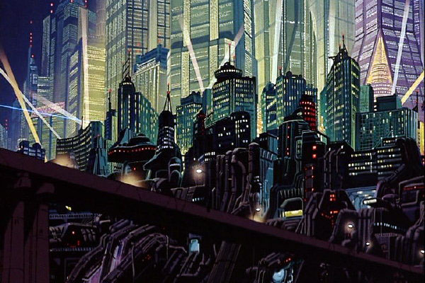
I have visited several other cities, and again felt fascinated by them, but I found myself thinking of fictional cities more and more, the most predominant ones that came to mind was:
Fritz Lang's Metropolis
Katsuhiro Otomo's Akira
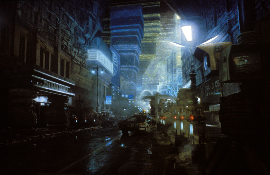
Ridley Scott's Blade Runner
I am drawn to these fantasy cities, all of which depict a future city, they all fall into the Sci-Fi genre, but as I thought about these crazy, dense and future cities, I began to realise, that in today, these cities are very much in existence, there is no difference between them when you look at them from this distance, if you view them at night the cities atmosphere can appear alive with the bright and wondrous artificial lights coming from every possible direction, they are appear quite stunning, but they are all essentially the same, and that applies to our current cities as much as these Sci-Fi cities.
London
New York
Tokyo
Upon realising this I question even more what fascinates me about these cities, they all appear rather similar, they all have a 'magic' and atmosphere to them, particularly at night, but why? If they are all so similar surely one would get dismissive after a while of them?
I began thinking of the why, I loved these fictional cities, mainly because of the story set within them, and as I love the story I begin to love the city in which it is set, and gain almost a familiarity to this city through.
Thinking back to London I began sectioning off in my mind where I had been, what do I love most, and why?
I enjoy wondering around the typical places like Oxford street and Covent Garden, but I always found exlporing the alley ways filled with record shops in Soho far more fun and intriguing.
Andre Kertesz
Today (Wednesday 17/11/11) we where given a lecture on the 'The City' by our environment tutor Steffi Klenz, looking at photographer's and their different responses to the city, starting from the earliest of city photographers.
Many of these photographers had works quite intriguing but the first I will look into for my project is Andre Kertesz, a hungarian photographer, or to be more specific photojournalist, who fled hungary immigrating to Paris and then in 1936 to the United States out of fear of the growing Nazi persecution of Jews and early signs of WWII.
This photograph, Meudon, was taken in 1928 during Kertesz' time in France.
Kertesz was a particular type of photographer, as stated at the start of Daniele Sallenave's book on Kertesz, it states:
"An idea in vogue has it that the artist must necessarily be in opposition to his language, that he has to force it, constrain it, and twist its syntax in order to mould it to his own design. However, another definition of art is perhaps not only possible but more accurate- that the real artist is someone who has been able, through patient work or with immediate insight, to discover the profound nature of the language he has chosen and its laws, and to fully exploit its forms of expression, from the most obvious to the most hidden."
Kertesz was very much a product of this second type of artist, as with this photograph Meudon, the location intrigued him, and he knew he could see something there, it was a lower class and poverty ridden area of Paris. Kertesz came to that area and that location on many occasions and waited great lengths of time, until he understood it, until he saw what he was looking for, the right moment.
Much like Kertesz' other works such as his "New York" taken in 1947, he utilises the straight edges and angles of buildings to create this image of confusion or something unnatural. This confusion and oddity applies to much of his choices in framing and the way he tiers pieces at different perspectives, for instance the train and train track does not appear any further away in perspective than the buildings themselves, as he links the edges of the housing to the train track to subconsciously join the items together in the mind of the viewer.
The oddity also extends to the man in the foreground, as it is clearly a poverty ridden and depressed area, as we can tell from the dirty buildings, the destruction and rubble in the background, and the absence of life or 'hustle and bustle' reinforces that this area has nothing. yet contrasting there is this man in the foreground, in a full suit, well kept and a top hat, we ask, who is he? why is he here? he does not fit into frame as this story of the deprived lower class area suddenly has it's most prominent inhabitant a gentleman? contrasting again to what his attire signifies he is carrying some large form of package, we do not know what this is as it is wrapped, but it is large and cumbersome, and surely a man of wealth would not burden himself with this package? If he has purchased something large and expensive surely it would be delivered?
We cannot answer these questions, but they are clearly present, and that is the essence of this photograph, and Kurtesz' style, he captures the unusual, the complex. Life is a very varied experience, and with the amount of people that inhabit a city the life of the entire city will be incredibly varied and unusual on a day to day basis, and that is what makes Kurtesz so intriguing, he sees and captures these stories, in glimpses of complexities which is a language most adept to describing the nature of a city.
Developing Ideas
As I have searched for a clearer idea of what it is about the city I wish to capture, I have slowly come to the realisation that not a lot has changed. Looking at the work of Alfred Stieglitz in the 1930's, particularly his "Looking Northwest from the Shelton" , cities have not changed much at all for a long time, they are simply a bit denser and taller in areas, so much like I noticed there is not much difference between the cities of the past, present and future. They all contain tall buildings that alone may look staggering, but with as many of them as close together as they are, they lose all value and meaning, but then the presence of more skyscrapers means the presence of more people, does that mean we lose meaning in this too?
This is an area that would end up touching on post-modernism too much and the concept of this project would have to completely change, but then I thought, what of the people?
Going back to Ridley Scott's Blade Runner, and the street scenes I particularly love the cross culture element, or even "pan culture".There is the Japanese geisha advertised on the skyscraper, there are future versions of the London Punk, or the coined phrase "cyber-punks", you can see Hari Krishna wandering the streets, and if you watch a few documentaries about this film, you will discover that there is also an invented 'city speak' used in this film that is a mixture of German, Spanish, Japanese and a little Hungarian, which is a result of globalisation and the cross culture element ever present in a modern world all blending together. This was an idea I would really like to explore, that 'pan culture' that is happening alongside these huge cities.
There have always been many different cultures within cities as a result of immigration, which is still a large issue being addressed in England at the moment which has been going on for quite some time, is it good or bad?
For my project though I want to stay clear of the politics and not look at immigration as such, but more out of globalisation, I want to capture that same mad form of cross culture we see in Blade Runner, where different elements of different cultures are all slammed together like it was common place, as though they where all one culture, some would argue that this means the cultures lose their individuality, but I personally see it as a form of acceptance, the culture doesn't change much, it just sits next to another almost, like in the movie still above, the punk walking alongside the Hari Krishna's like there is no difference between them.
In trying to find this unusual cross culture element, where the out of place becomes common place, I will be shooting in Camden Stables Market, London.
The reason I am choosing this location is that, albeit something of a tourist attraction, it is an area crammed with subcultures.
I want to specifically look at the Market Stables as it used to be a hospital for stable horses, and has overtime adapted into a market area, the stalls are all mismatched and darted down what would have been large ramp ways, arches or individuals stalls for horses, and any permanent market stalls have very much adapted their merchandise around their sections and not altered them, so there is a real sense of contrast between the new CD's of fashion on display on old Victorian walls. The cultural aspect intrigues me as well, as the market stalls are predominantly fashion based, but chain companies are not allowed to set up in the market area, which has resulted in a mismatch of your tourist "I love London T-Shirts" next to traditional Indian scarf's and furniture next to extreme Gothic clothing. The area has spurred much in the way of sub culture particularly with the "Gothic" or "Cyber-Punk" groups, overtime it has become quite a tourist attraction and some of the eccentricity and sub culture move away with this, but it still maintains this eccentricity in any new developments to the area and so it is a perfect location to capture this idea of a muddled cross culture.
I went to Camden first with my DSLR, to get a feel for the area and try for some digital test shots to find the best shots to portray my cultural mismatch I want to capture.
I tried finding areas where there where strange samples of different cultures, and styles that did not seem to fit, but yet where all placed together.
Contact Sheets
I returned to Camden on two occasions, shooting hand held on ISO400 Fuji Colour film, with a Bronica SQ-B.
In truth I had many problems with motion blur, as my film was simply not fast enough to shoot handheld in Camden Markets, however it was a compromise made to help my photography go fairly unnoticed as I was able to 'shoot from the hip' around the markets, generally not disturbing the crowd.
Much of my selection was a variation between which shots that where not subject to motion blur but also which ones that seemed to frame my idea of the mismatch culture the most.
My final three shots were the following:
Looking at my idea of the cultural mismatch of a city, and the random chaos that forms them, I picked locations where the where the most oddities in architecture around the market and food court areas. With the first frame it was the contrasts, and 'cut and paste' nature I loved about it, the old Victorian street clock next a set of traffic lights, the traffic lights also being mounted on an alley wall where there are no vehicles to require them. The old stable doors on the left that had become small shops for various clothing, but retaining the intricate designs on the big stable doors.
In the second frame, I chose this location for the chandelier above all else, again it is an alleyway market in Camden, I liked the general mismatch of products on display here, the typical tourist London T-shirts opposite an Egyptian art stall, all crammed in an underpass valley, and the chandelier being the most contrasting aspect, in all it's extravagance, illuminated what would otherwise be a dank looking underpass.
The third frame was a shot taken in one of the many food courtyards, with every type of food of the world displaying their neon signs next to one another. The focus I chose for this shot was of course the Indian themed seating area, that looks more like it belongs in an elaborate garden, yet it is smacked next to countless cheap fast food stalls.
In truth I would have liked my colours far more saturated and in a higher contrast to emphasise the idea of the cultural 'wonders' the city holds, but in terms of my film choice I had to go with a faster film to enable the handheld aspect of this photography.
This unit, The Body, aims to explore the representation of the human body, specifically at portraits.
Answering first of course, what is a portrait? A portrait can be made in many ways, both abstract and simplistic, but, fundamentally it must represent a likeness to the person or subject, be it a visually simplistic likeness to facial features, or if it delves deeper into portraying this persons inner person.
A portrait is not just a simplistic recording of a persons appearance, as it uses much of the same principles of still life, the same use of semiotics can be applied to the portrait to tell a deeper and more complex story of the subject.
This can complicate portraits even further, as it then means that the likeness to the subject does not necessarily have to be through the subjects physical appearance, the subject can be visually obscure and their likeness be told through the mise en scene depending of course on the personality of the subject and the intentions of the photographer.
For this unit our subject must be unknown to us, which leaves the portrait incredibly open and potentially difficult to us.
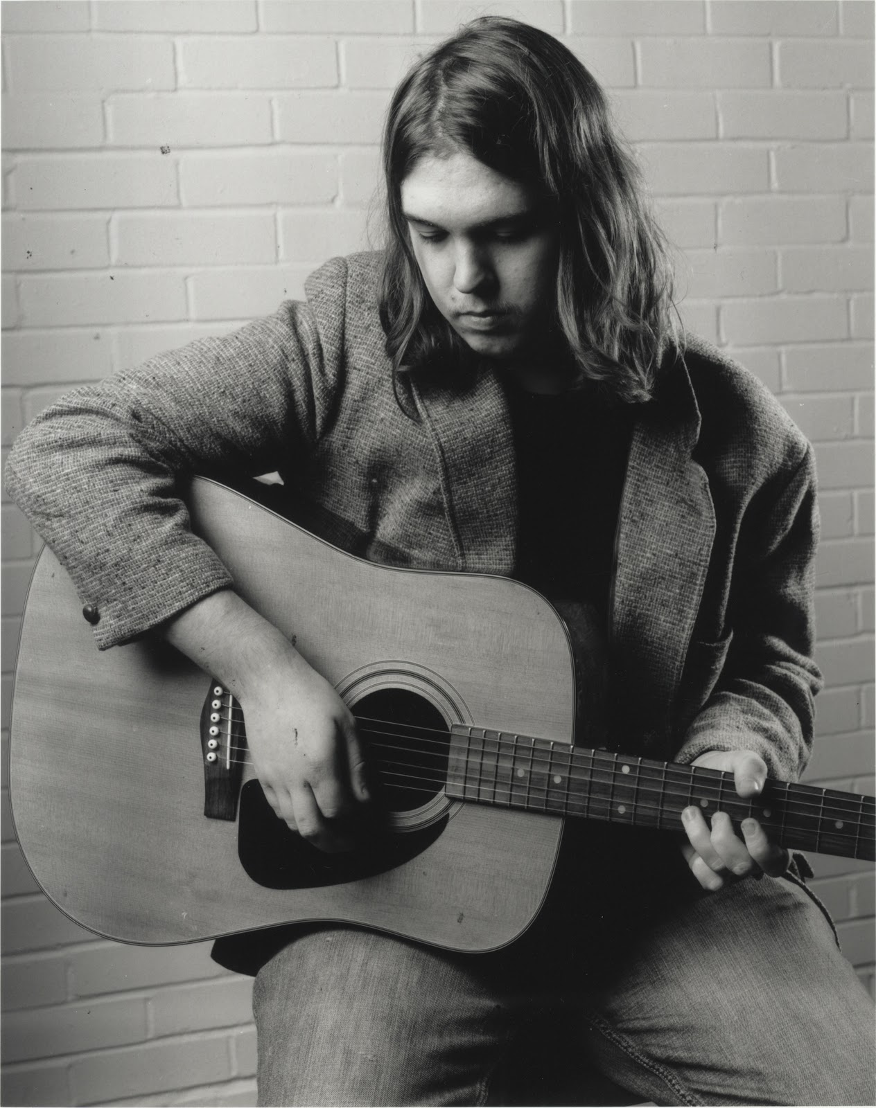
For my model I will be using a musician from the Medway area named Liam Lynott. He is a local Blues Guitarist, who works both solo and with a band named Broken Banjo. I have come to chosing him as my model, as he often plays at local pubs I frequent, and whenever he has played, he has always had bands lined up around him that are completely contrasting in musical style. I get the impression of a man born in the wrong era, as the bands he is surrounded by are quite simplistic and best summarised as 'pop culture', yet frequently this young blues guitarist will get up on stage and play his blues. I almost view it in a sense of purity, it is simplistic in action, to simply get on stage and play, without care for the crowd or from judgement, he is simply a musician, and a musician plays music. This is a concept I would like to explore with my portrait of this musician.
The Motorcycle Diaries
This idea of showing him in simplistic honesty, came entirely from The Motorcycle Diaries, which is a film by Walter Salles based on the journals of Alberto Granado and Ernesto Guevara, Ernesto Guevara would later become known as the revolutionist Che Guevara.
The reason this film has inspired my idea and visual style so much, is that this film is based on a journey Ernesto Guevara took before he became part of the Cuban Revolution, however it is what drove him to revolution. The idea of his journey was simply that of adventure that he shared with his friend Alberto, they wanted to explore their land, and along their travels they agreed to stop at certain areas dealing with leprosy as they where both medical students specialised in this field.
This almost 'teenage dream of adventure' turns into almost a pilgrimage, as he explores Latin America and sees poverty and injustice where ever he travels, his eyes are opened. Throughout the film there are scenes that contain 'moving stills' where they portrait the people he meets, and shows them in honesty and simplicity.
We see these people in snapshots of their life, they presented as though there is not a camera, they simply turn and seem to almost bare their soul, if the camera continued you could almost imagine them turning back to their task and to have the world suddenly snap back to life, as though there never was that pause.
It is this idea of simplicity and honesty that I wish to capture.
Arnold Newman
I was first put on to Arnold Newman when I saw his portrait of Stravinsky hanging on an office wall in the photography department.
Igor Stravinsky was a composer, pianist and conductor, and widely acknowledged as on of the most important and influential composers of the 20th century. His compositional career was notable for its stylistic diversity, he was commissioned by the Impresario Sergei Diaghilev (performed by the Russian Ballet), these where The Firebird, Petrushka and The Rite of Spring. The Rite whose premiere provoked a riot, transformed the way in which subsequent composers thought about rhythmic structure.
As his musical style was so different it has often been said that he revolutionised music and really pushed the boundaries of musical design. This all started around 1910 along with a new wave of art form as well like the birth of cubism, and slightly later on coinciding with surrealism, and Stravinsky himself was once painted by Picasso.
From a mere glance at this photo if you are even vaguely familiar with the works of Picasso (as most are) you can identify that this man whether you know him or not was part of that art movement, and this is simply from the way we see the background and the piano, as the background is not quite natural, it is two different colours, one a very light grey, the other quite dark, but the colours are so solid, and not equal in proportions either that they are obviously not a natural backdrop, the piano becomes part of this as well, as it is more or less a complete silhouette, so we see the light shade, middle shade, and the the piano is the dark shade, so we see a colour spectrum almost from white to black with these three colours. With the angle of the piano as well, if you remove Stravinsky from the photograph, it could blend in perfectly with cubist paintings, and the piano is no longer a piano, it is only recognisable as an abstract shape. This technique is incredibly as it makes us lose our sense of depth and perspective, and the piano merges with the backdrop, but with the presence of Stravinsky leaning on it, we suddenly identify it as a piano, so we know it is a physical object, but it does not appear as such. This loss of depth makes the portrait completely part of that new wave movement of cubism and surrealism, particularly as the abstract shapes take up the majority of the frame, we identify Stravinsky as completely immersed in this style, this alternate world.
This incredible use of the props and the backdrop has expanded my thought process far more about how to show the musical and artist style of my subject.
After seeing this portrait on the wall, I decided to get out his book for inspiration and it was opened with a foreward by John Hayes (Director of the National Portrait Gallery) who said:
Of all forms of art, portraiture is one of the most elusive, and one of the most difficult for any artist effectively to master. This may well sound a paradoxical thing to say in view of the number of artists who practise it. But I think they would agree with me. It is partly that the human face, though of compelling interest to every one of us, remains the most mysterious of all subjects; and partly that, once an artist has achieved a likeness which he thinks credible, the pictorial means at his disposal - design, colour, line, associations - for amplifying that likeness, for defining the individuality of posture, gestures, movement, above all for revealing personality, are severely contained.
This quote I believe quite poignantly summarised the portrait, and the problems one is faced when creating one, as we have many tools at our disposal to enhance this personality, much like the abstract shapes and piano in Newman's Stravinsky, but in creating the photograph you are still squashing something 2 dimensional, and how do we present this 2 dimensional person? For if too much direction is given doesn't that mean that you have forced and constructed what you see of that person, doesn't that make the portrait not a portrait, but instead your own interpretation? Which means you lose truth in the image; there is a quote about individuality from a Japanese Anime known as Neon Genesis Evangelion written by Hideaki Anno, which is that "Every self is composed of two selves, the self which is observed, and the self which observes itself, there is the you in your mind, and the you in the minds of others" and I find myself referring back to this quote again again, and it summarises quite well the issue one is faced with when taking a portrait, do you portrait the them that you see? or will you try to find a way to see the them they see?
Arnold Newman has written himself, that he is 'convinced that any photographic attempt to show the complete man is nonsense, to an extent. We can only show, as best we can, what the outer man reveals.'
Philip Lorca Dicorcia
Phillip Lorca Dicorcia combines two very different principles in style for his photography, combining the documentary snapshot styling with theatrical lighting like you would expect to see in cinema or advertising creating very powerful portraits.
He wanted to capture people in their complete natural state, but he also has this idea of drawing emphasis and drama towards them which is a very hard concept to achieve. He began by using family and friends to every day things but in a constructed and controlled environment, but finding these too forced and set up he began a far more difficult task of hiding lights in public urban areas and taking his shots discreetly and out of view, bringing controlled lighting out into an uncontrolled urban environment, to make sure the subject is clear, and emphasised but also so that they could not be in a more natural state as they are not even aware they are being photographed. His most noted work in this style was his series Heads that was done using a controlled lighting mixed in with the standard lights in the New York train station and a hidden camera, in order to catch commuters when they are absorbed in their own world, their own natural 'bubble' state if you will.
As he captures people on their commute he actually captures people in a rather intimate and personal moment, as during a commute most people are not social, everyone becomes separate within their personal space focusing on their journey of A to B and nothing more. So it is a very solitary and honest state of self one becomes involved in as you switch off to being no longer aware of your surroundings.
In capturing this moment Dicorcia captures an incredibly honest state of being with these people.
Reflecting on Dicorica and Newman's work there are elements of both I would like to combine. Phillip Lorca Dicorcia captures people in a natural honest state, which is a theme I want to centralise my portrait around, the idea of simplistic honesty, however Dicorcia uses the same lighting for every shot, and his set up and style is very reminiscent of advertising lighting, and I want something far more naturalistic. This is where I want to sample Arnold Newman's approach, as I first simply looked at his 'Stravinsky' as I was so impressed with the visuals of this piece, however looking over many of his other portraits:
Willie 'The Lion' Smith
John F. Kennedy
You can see that Arnold Newman does not stick to one visual style with his portraits, he instead tailors his entire mise en scene around his model, for instance his 'Willie The Lion Smith' is tailored completely to a traditional jazz scene, with the smokey club, the studio lights in shot, and the stacked bar chairs. The same with his John F. Kennedy, with the powerful low angle on the white pillars of the white house, but with Kennedy himself a more humble and less overbearing figure.
I wish to take this idea of tailoring my mise en scene to my model from Arnold Newman, but also I would like to capture a sense of honesty and naturalism, so I shall combine the ideas of Dicorcia and Newman.
I will tailor my lighting, and setting to something simple that will also reflect on my model being a blues musician, and I will simply ask him to play, hoping that after a short while my model will forget his studio surroundings, and begin to simply play as he would at any street corner or venue, and this will help me achieve my sense of simple honesty.
Posing and Lighting Exercise
As part of our portrait unit we spent two days in small groups practicing lighting and poses, creating different emotions and stereotypes through subtle changes in lighting and posture, experimenting mostly with standard reflectors and soft boxes on Broncolor studio flash systems.
Utilising a few objects at hand in the studio or from our bags, we created several job role stereotypes, a builder, a waitress, a cleaner and a scholar. We altered our lighting set ups with minor adjustments for every shot, however the main focus of this first exercise was posture and framing, subtleties like the hunched scholar, immersed in his book, looking of his shoulder at the world he pays little attention to. The builder shown through straight body shots, to show a simplicity and honesty, but also a pride in the worker standing straight by his tools, looking directly at the camera.
This exercise was designed to make us think on our feet about how we tailor the posture of our models to suit the intent of the photograph.
Our next exercise was similar to the first however this time we focused on posture and expression without props, and altered our lighting to suit our intent far more. Instead of job roles, this time we focused on emotions, or traits, like pride, sorrow, honesty or arrogance.
We switched back and forth between soft and hard lighting, we also paid a lot of attention to our camera angles, for instance a low angle to create a sense of power for pride, or a high angle for sorrow.
Studio Shoot
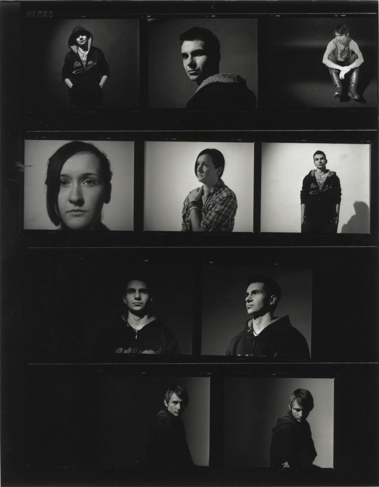
On the day of my portrait shoot I decided on experimenting with two different sets of postures on two rolls of film.
My lighting set up used a prolite with a large softbox as my main light, which was positioned above my subject looking downwards on him. My fill light was also a prolite, however I used a standard reflector attachment and utilised two black polly boards to create a strip spotlight to highlight the left hand side of my subject, this light was set 3 power stops down from my main light.
On my first roll of film I asked my subject to simply sit with a neutral expression and look towards the camera, I leant his hard black guitar case against his shoulder, using my fill light to catch the edge of the case. The idea behind this was an attempt at mimicking Arnold Newman's 'Stravinksy', I wanted a standard portrait shot of my subject looking towards the camera, and tried to silhouette the guitar case much like Stravinksy's piano. I kept the brick wall as my backdrop in order to maintain my idea of honesty, as a black or white backdrop makes this an obvious studio piece, but the wall gives it an ambiguous but everyday setting. I was not pleased however with the framing of these shots, a guitar case proved too small to effectively recreate Newman's 'Stravinsky' and my models expression and posture was obviously too awkward.
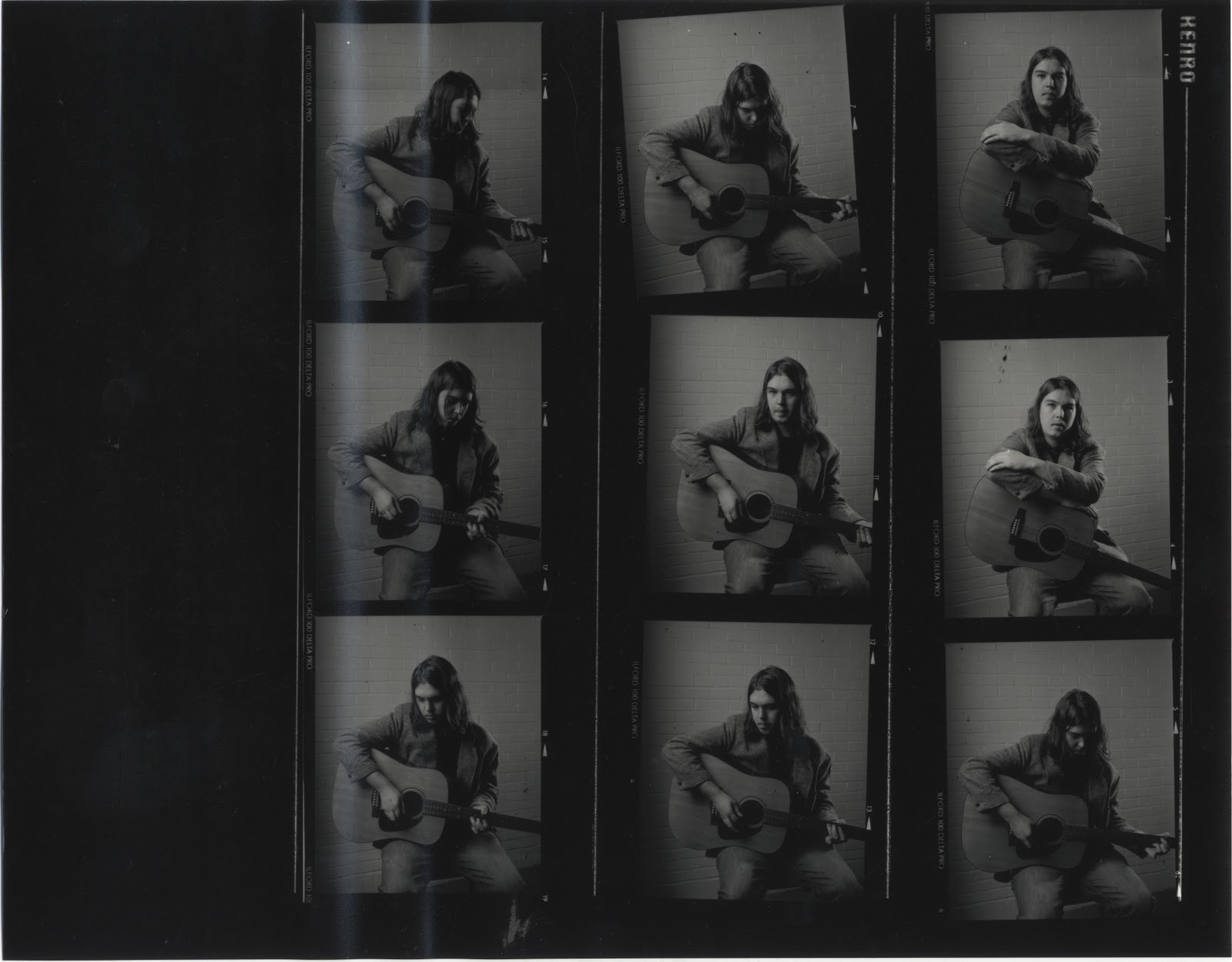
For my second roll of film I kept my lighting set up the same, but repositioned my subject so the fill light would catch and highlight his left edge more. For this series I asked him to merely play a set piece as though he was busking on the street, which eventually relaxed my model and he began to play naturally, his expression and mentality focusing only on his music. With him involved in playing I simply shot slowly and steadily as he continued to play, in order to capture a more honest expression and posture from him, which I found to be far more effective.
This shot was my final selection from my contact sheet, as I found my model to have the best posture and expression in this frame. I found I preferred his posture most in this frame, as it is clear he in the middle of playing by his hands and arms positioning on the guitar. I also prefer his expression most in this frame, as his entire face is visible, but he is not looking or focused on his surroundings, he is clearly seen as involved only in the music he is playing. My idea of honesty and simplicity in identity I believe to be quite clear in this photograph, as the lighting is very reminiscent of older style Blues and Jazz musician's portraits, being very soft on the skin with clear texture, but drawing on many shadows in the posture of the musician as well. The brick wall behind works well here as well, as the lighting is unnatural and that of a studio, but the brick wall creates an ambiguity in his location, for instance this could easily be at a venue or practice room that he is playing in. The fact that my model is not focused at all on the camera reinforces my intent as well, as he is simply himself, and his self is simply his music.

 Her use of water in this particular piece makes a perfect metaphor for what she creates with her work, this idea of the mirror world, the human world we have made but suspended in almost a form of spiritual limbo.

 She works with the camera obscura, creating direct imprints on paper negatives.
 Again through out her work she utilises the camera obscura for this 'raw form image'. The direct transfer of experience.