This resulted in my series showing inconsistencies in their composition and conceptual meaning.

Certain images, like my industrial city scape above worked quite well and showed a glimpse of what I was trying to achieve. Compositionally it works best as it contains images of the road, acting as a portal into the image, or a vanishing point. I gives an element of realism to my unreal scene as it acts as a gateway for the eyes of the viewer. The structure, shape and arrangement of the buildings here also work best as they have an angular uniformity, each leads to the other and they stack / slot together with method, and build up a progressively taller and impossible cityscape. The use of lens flairs and light add to this structure, and work in tandem with the smoke present in the image to build up the visual conception of the image.

Others in my series however unfortunately do not work as well, which is where the lack of further research begins to visually take surface in my final series. There are attempts to replicate the notion of the gateway like in the above image, where I have included a small portion of the road at the lower left side of the image, again attempting to draw the eyes of the viewer in. Unfortunately the placement of this gateway and the subsequent buildings render this ineffective, as the vanishing point the road creates is in the wrong position and not visually clear enough, it leads the eyes away from the main content of the image if anything. Next the buildings do not fit together in the same uniformity of the industrial image, their angles and perspectives conflict with one another instead of flow, switching the visual perspective of an impossible cityscape, to simply something obviously false and constructed, shattering the intended concept of these pieces. Attempts where made to utilise a variety of colours within the lights of the building to reflect this district of 'entertainment', however they colours emitted from the lights more clash the buildings together rather than illuminate and dazzle the viewer.
There are similar positives and negatives throughout the other four images in my series that are reflected by the conflictions of the above two images, which reflect the lack of depth in research, as this meant I had short comings when it came to the subtleties in the construction of the images. Where I focused a lot on a technical editing skills within the images, the lack of research in visual concepts meant that I had short comings when it came to the arrangement and consistencies within the series.
New Research
Paul Citreon and Cubism

Paul Citreon is a person I looked at previously for inspiration on my project, however I simply observed his pieces for Metropolis as visual keys or references and failed to actually dive into detail on why his work is so effective.
Paul Citreon was a student of Cubism, and his collaged cities very much reflect the style and ethos of the Cubist movement.
"The Cubist painters rejected the inherited concept that art should copy nature, or that they should adopt the traditional techniques of perspective, modeling, and foreshortening. They wanted instead to emphasize the two-dimensionality of the canvas. So they reduced and fractured objects into geometric forms, and then realigned these within a shallow, relieflike space. They also used multiple of contrasting vantage points." - Cubism, Heilbrunn Timeline of Art History.
The ethos of Cubism is very much reflected in Paul Citreon's city collage, he embraces the 2D nature of the canvas instead of attempted to trick or fight the flat nature of the canvas, and by embracing these multiple perspectives he creates the illusion of depth with this piece. The multiple tunnels and vanishing points create a variety of portals into the piece, they act as entry points for the eye and reflect the nature of everlasting complexity of the city, the idea that you can never truly see all there is to see, there is a endless detail and depth that cannot be fully explored.
Rather then neatly cutting out each individual building to slot together, he takes rudimentary square cuts of scenes, the straight lines of where one piece overlaps the next is obviously present in the image, however the arrangement of where those cuts take place depends on the arrangement of the buildings. Rather than worry about parts of images being cut short he instead matches the angular lines of the surrounding images so that the pieces although obviously separate cut outs, slot together like puzzle pieces into the one image.
From his work I can see the importance of shapes and portals. That the realism of the individual images used is less important, and more how they fit together like rudimentary shapes, and that correct perspective or angles will not necessarily remove the illusion of the 2D canvas, more that portals within the image, gateways for the viewer to look through, will remove the 2D barrier of the canvas.
Sohei Nishino


Sohei Nishino is a young Japanese photographer obsessed with mapping the endless details of cities. His method is to relentlessly photograph as much detail as possible around a city, he takes thousands of images, recently in London as much as 10,000 total, which he then meticulously edits down until he has a complete spectrum of the city of which he can be carefully cutting and slotting together.
The result is a complete spectrum of unbelievable detail mapping each corner of the city. Many of his images are mapped out in black and white, turning the contemporary city into looking like a detail medieval map.

His visual language is rather reminiscent of Paul Citreon, the subtle distortion of perspective shifts the 2D nature of the canvas in similar ways to Paul Citreon's work. Sohei Nishino however creates a more flowing piece from smaller puzzle pieces enabling him to create a more flowing cityscape rather than Paul Citreon's angular images.
I am most interested in his use of colour in his night images however, particularly the use of the lights from cars on the roads, they lend a quality to the images that is very different from the black and whites of Paul Citreon. There is a greater sense of wonder and illumination from the images, his pieces are far more pulled out and detailed than my images as Sohei Nishino wishes to almost become a cartographer of the cities through his camera, however the illuminated roads create an 'otherworldly' feel to the image, as an illuminated walkway to an impossible city.
Michael Wesley


Michael Wesley is a master of incredibly long exposure photography, using his own hand built custom pinhole cameras, he has taken as long as 34 month exposures, as was the case for the deconstruction and reconstruction of the Museum of Modern Art in New York in 2001, ending in 2004.
Such a long exposure lends the images a ghostly and ethereal quality, they present a world of many layers, a scene that is not quite real yet very sharp and definite at the same time. The sun lines tracing the skies in the image make the scene seem unnatural and almost impossible, like a scene from a sci-fi or a city of future distances.
This notion of deconstruction and reconstruction present in the image is an idea central to my own projects concept. As I look at the nature of our cities, the condensed variation, the new being continuously built atop the new, is all present within this image. The ghost like after image of the old shimmering around the literal fusion of the past present and future into one image, it reflects our history, our nature, and the stage of progression we have now attained when the old can be completely smashed and obliterated to pave way for the new, all in within the space of the shutter opening and closing.
I wish to take influence from this idea of the ghost, the transient, the shadows of the old paving way for the new, reflects my projects concept quite eloquently. It shows the endless progression, destruction and reconstruction, you see what is lost but also what is gained within the image.
Catherine Yass


Catherine Yass is an English photographer renowned for her series that explore the nature of light in depth, and take alternate processes in order to portray the nature of light and it's effect on a space.
Her series Corridors contains eight photographic transparencies that are displayed in light boxes, featuring unusual luminous blues, greens and yellows emitting from the light sources present in the image. She achieves this through the combining of both the positive and negative elements of film, allowing the negative to come through the light sources within the image in order to create unreal portals of light.
The shallow depth of field in these images works in tandem with the negative light overlay, to make the viewer feel caught in between spaces, the hospital corridors only enhances this idea of in between worlds, a transitional moment almost between the positive and the negative. The idea being that the audience is immediately engaged and disengaged at the same time, they are dropped into this space, this empty gap in between the two images.
Her images present an intriguing concept behind light, that it can serve as a gateway between worlds, that the way light reacts and the colours of light are the very thing we use to determine what we would define as 'the real'. As we rely on light to see and perceive colour, and we rely on sight to determine what we perceive as real or unreal, these images present a questioning to this 'reality' or how we perceive real, as the postive cannot exist without the negative, yet we only acknowledge the positive as the true image. Catherine Yass subverts this, and drops the viewer in between spaces, in between realities, through the combination of positive and negative, it becomes impossible to determine what is the 'real' what is the 'true image'.
Her method of using light is something I must consider in reflection to my own work, as I am looking at both the real, and the unreal, as I fuse real images of real buildings and scenes, but I fuse them together into the unreal, much like Michael Wesley's work I am considering past present and future all within the one image, I am fusing 'what is' with 'what may be', but my desire on how I wish these images to be perceived is similar to that of Catherine Yass, the viewer must be 'in between spaces', in the case of Catherine Yass she places the viewer in between the positive and the negative through her manipulation of light. I aim to place the viewer in between reality and fiction, between the definite and the uncertain.
Szymon Roginski


"It is dark, cold, and there are no people. There are houses and fences. Trees and bushes. Frozen gound. Roads that disappear in the darkness. Some are full of potholes; others end in the middle of nowhere. In the fields and beyond, trees loom like illuminated structures, some more complex than others- as if they are waiting for someone. The inns, in turn, look no as if they are waiting for guests, but simply enduring, solidified in a strange glow. The houses, too, are illuminated - as if at an interrogation, or in an empty dance club. Light occasionally beams from an empty window. In the back gardens, beyond the fences, you can sometimes find an isolated tree dressed up in lights. The bus stops and benches are empty. The sheds are to stay. There are posts and roads signs. The street lamps glow, the inscribed plaques and tablets hang, the crosses stand. Someone hangs on the cross. He doesn't exist any more, either. There is light: A light that brings out the silhouettes, textures, and colours. It is white and colourful; warm and cold; weak, strong and explosive. It is dark and cold, and there is no one. It's time to take a ride - until dawn, when all this will disappear."
- Szymon Roginski, Poland Synthesis
Szymon Roginski is a Polish photographer that mainly deals with documentary topographical photography, he however has crossed the line with his series "Poland Synthesis", between the documentary and the fantasy. Postcommunist Poland is pictured by Roginski as gloomy, unnerving, and almost alien, but in that depiction, also comes wonder, and fantasy. Certain still are reminiscent of still from horror or thriller cinema, others are more fantasy and hallucinatory.
He uses the gloom, mist and harsh weather of Poland in winter to his advantage through the long exposure, as the light defuses and spreads, illuminating the solitary features of the Polish landscape in colours that lend a wondrous intrigue to the scenes presented. Similar to Rut Blees Luxemburg, the night becomes a transitory period by which one can be transported to another world, as something as simply as the presence of people and the way in which light spreads across a surface, can be the difference between realities.
The unusual colour and notion of "illumination" is something integral to my work, as it is the world being lit by the artificial, with the void of natural light one can see the world in which we have shaped it as our own.
It creates a fusion between reality and fantasy, as one takes reality, and what under natural light can appear as the mundane, then if one fuses the real with the artificial, we gain an entirely new world.
Szymon Roginski's work reflects on the night as it's own world, a separate reality, that is both wonderful, yet incredibly solitary, an existence only made possible by the spread of artificial light. Our constructed fantasy that exists between the reality of sunset and sunrise.
This series links in great deal to my early conceptual stages, along with when I was looking at the work of Rut Blees Luxemburg, I was looking at the night as a man made parallel world that we have created for ourselves. My concept of course has moved on considerably since then into looking more at our artificial nature, and the construction and reconstruction of our ever evolving artificial habitats of the city. The night is still very much integral to this project however, as it works visually in tandem with the notion of the fantasy and the artificial, this idea of illumination seen in Roginski's work is something worth considering pulling back into the project, furthering the extremities between light and dark, the realities of the day that disappear and the fantasies of the night that emerge from the artificial light.
Yenny Huber


Austrian Photographer Yenny Huber works with film to explore landscape cities, her project 48 hours was designed to show the many facets of various cities, empty, lonely places, and streets, grand buildings, railway stations, all compressed and overlayed into dense images, designed to take the viewers eyes into complex exploration of the image.
48 Hours was made to explore the diversity and contradictions of a city, looking not only at palces of wealth and prosperity, peace and quiet, but also at those that have been neglected and forgotten. Yenny Huber plays with the notion of time, and attention span within this series as well, as she only takes 48 hours per place in order to capture it, making a conceptual commentary about not only the diversity and density of our contemporary cities but also the time we take, or lack of, to consider these spaces.
Looking both at historical, older, or poorer sections of cities as well as the contemporary and the affluent, Yenny Huber engages teh deep complexity that is embedded within a city in terms of its history, culture, its conflictions, and it's beauty, addressing both complexity and solidarity within the metropolis.
The overlay of her images are almost a hybrid between the extremely long exposures of Michael Wesley and the photo montage maps of Sohei Nishino. The lines of construction and architecture overlap and create an ethereal ghostly city within some of her images, similar to that of Michael Wesley, however through a similar methodology to that of Sohei Nishino, in the literal photographing, overlaying and condensing of the different elements of the city.
Similar to my work, Yenny Huber is looking a both the old and new elements of the city, and shows its extreme complexity and diversity. Her literal overlaying however is a visual strategy to consider as an addition to my final piece, similar to Michael Wesley's work, it combines the very sharp, clear and real elements of the city, but the ethereal and complex nature of its exploration.
Her 48 hour time limit is something akin to my method of shooting in terms of picking a space, exploring the space, and then collating the imagery at hand into one condensed piece, reflecting both the shear scale of diversity and complexity one finds within the city, but also the short time frame in which one can experience such a scale of information. Memories of buildings and spaces blur into one, as time passes so quickly and the new experience becomes the old, as more of the city is seen or erected on top of the old.
Her images remind me of Ridley Scott's method for constructing the street scenes of Blade Runner, the idea of all cultures merging together, until the language itself becomes a hybrid mismatch of each culture, so that the individuality of diversity is lost.
If you immerse the viewer in such rich and detailed complexity and diversity, the city can seem endless and wondrous, but if you display such diversity all within a single condensed frame, diversity becomes similarity, as the different elements are merged together into one mass entity of life.
Reflection
I believe strongly in my projects concept, and so it very much remains the same in my intended meaning behind the work. I wish to show the rapid, condensed, evolution of the artificial in which we live. Our cities are expanding and rising rapidly, our towns slowly joining together in expansion and (in the case of my home of Medway), attempting to become cities themselves in their own right (http://news.bbc.co.uk/1/hi/england/kent/8585429.stm).
The city of London being incredibly multicultural and diverse with a population of 8.1 million and over 6 million foreign UK nationalists living in London, it is (as described by the Guardian) the world in one city.

(http://www.theguardian.com/uk/interactive/2012/jun/22/london-foreign-nationals-map-interactive)
Looking to the city of Dubai, we can see the rapid growth of the artificial, and just how fast can create as humans, as only 20 years ago the city was almost entirely desert, and it is now world the capital for extreme wealth, luxury, and contemporary architecture.

Our cities are growing and emerging rapidly on top of the old, the artificial lights that create our parallel world of night are increasing in density and slowly joining one another into an endless network of density.
I believe that elements of my previous series of 6 images did represent many of these ideals quite well visually, but as a series, and in some case as standalone images there was fragmentation in consistency, and visually my concept and ideals where not quite as refined as desired.


The illumination of many of the buildings is too neutral, too plain, in balancing the images to match up and connect as one, I lose the fantasy, other-worldly lighting of Rut Blees Luxemburg, or Szymon Roginski, upon revisiting my work, I must work with the light more, and utilise it complement the unreal nature of the city montage I create, similar ideals or techniques like that of Catherine Yass are to be considered in order to draw the viewer into the image.
In terms of my methods of layering, my previous technique is more akin to that of Paul Citreon in that I carefully cut out each segment and slot it together, however, the scale of my scenes are far smaller and different to that of Paul Citreon or Sohei Nishino, and therefore I am unsure of the effectiveness of that strategy on my piece, as Paul Citreon works with more ariel shots of the city, and uses individual buildings on a smaller scale in order to transform the 2D nature of the canvas, where as my visual works best in images above that contain focal points of perspective. I must consider however Paul Citreon's use of portals more closely, as my industrial image above works strongest as it too contains visual portals for which the viewer may enter the image.
From my new research what stands strongest to me if the visual language of Michael Wesley's work and Yenny Huber. As I am using exisiting buildings and city shots I have taken to create these scenes of an endless city scape, similar to Yenny Huber, however the notion of the overlay, the ghost of the building, lends a far more complex and ethereal quality to the images, where one has far more visual opportunity to explore the details of what lies under the surface of the image. This enables me to have a better equilibrium in my concept, as my aim is to create fantasy cityscapes of endless construction that appear unreal and of another world, however it is to be done as a reflection on the marvel of our current very real artificial constructions that we are constantly building and rebuilding. In utilising a level of overlay in my image, I will aim to create a better balance between the reality of the original images used, and the fantasy of the construction in which I place them, as my previous images where too obvious a fantasy construction of me the creator, therefore I will try to bring back an element of the original image, so that it is simultaneously real and artificial, fantasy, and truth.
New Image
As a recurring criticism of my previous series was the lack of entry points or portals present for which the view may enter the image and begin to be lost within it's complexity.
With this in mind I am going to begin some rough arrangement attempts, disregarding the full technical process for the moment I will simply try rudimentary arrangements to come up with a 'blue-print' or a visual format to work with.
Looking at the work of Catherine Yass I will begin by playing with the notion of the corridor, and potentially like her work, an unnatural light or another portal at the end of the corridor.

Using this rough painted outline I will begin very roughly cutting and pasting imagery to get a better visual idea of this format.

Taking a leaf out of Catherine Yass's book and work with the notion of the corridor it presents a greater sense of depth, it draws in the viewer to the vanishing point of the image whilst the walls entrap the viewer within the space.

I experimented by roughly cutting out a variety of buildings and altering their perspectives, via the free transform tool following by altering the perspective to draw the viewer into the centre of the image.

After altering the perspectives of the buildings in order to draw the viewer in, I then place a bridge across the top of the image in order to play more with portals and give a greater sense of depth to the image.

In using curved buildings and enhancing their perspectives I have created a visual tunnel effect and vanishing point into the image. I was critiqued on my previous work for not understanding shifting subtleties in the space of the city, hence I am attempting to work more with perspectives, portals, and vanishing points, in order to visually engage and entrap the viewer more effectively.
Obviously the I made no effort to adjust color and lighting, nor did I take great care in cutting out the buildings for the above image, my current aim is to produce a small handful of quick experimental images like the above in order to deconstruct their visuals and then piece them together into my final image.

Architecturally speaking these buildings clash in style completely to the lower industrial bulk of the image. They do however sync perfectly with the angle of the industrial shot, and help building up layers around my vanishing point. If this is to remain in my final image I must consider using more of this architecture on the left hand side of the image in order to blend it as another layer of the city.

The architecture of this building of course matches the industrial shot below, it's placement / angle however clashes with the vanishing point of the image. This would have to be removed and replaced if it where my final image.

Empty Space clashes with my ideal of endless construction. Consider using additional buildings to fill image.
Next Image
My next experimentation will revolve less around composition and more on visual effects. I will try a very different approach of more abstract pairings of buildings and imagery to compare. Again I shall work with this notion of the corridor, but for this image I will experiment more visually, taking inspiration from Catherine Yass's series.


This image, as stated was less concerning composition, and therefore I have embraced an image that is more abstract in arrangement in order to observe the two different approaches to my concept.
I believe as this rudimentary arrangement I prefer my first image, as the placement of buildings is the main factor within my work. As stated however this is more to experiment with styles, or visual effect. Looking at the work of Catherine Yass I want to experiment a little with light, and making it more abstract, as my concept contains much on the impact of artificial light.

I took the central image, and inverted it's colour in order to overlay my positive and negative space, like Catherine Yass. However I was not wholly satisfied with the visuals of the central building, so I instead created a duplicate layer of my central building, one positive, one negative, and then I changed the blend modes of these layers to partially merge them.

I am currently unsure of this effect, however I wish to push it further in subtle ways to see what a more refined effect would look like. The main issue currently is the clean cut barrier between the inverted central image and the surrounding buildings, so I repeated my process of duplicating buildings, one positive, one negative. I then used masks to reduce the amount visible of the inverted buildings in order to let the light 'bleed out' from the central image into the surrounding images.

This effect of an unnatural light source is very intriguing, and deserves further experimentation, however currently I feel it seems too strong an effect, and too close to Catherine Yass visuals instead of my own. It is something however I will try to utilise in a more subtle manner in order to draw additional focus into the center of the image.
There is one other style from Catherine Yass's work however I wish to try, in order to further play with the notions of perspectives in my work. This is the depth of field in the image. Something that is ordinarily achieved of course via choice of lens and aperture, that I will artificially recreate in order to play with the notion of the viewpoint.

Overall I am very pleased with my artificial shallow depth of field, as it further tricks the eye of the viewer into a confliction between the 'real' and the 'artificial'. It lends greater visual credibility to the perspective the viewer addresses the image from, however it's effect will have to be considered in regards to the composition my final image takes.
Next Image
I now want to experiment with transparency, like Michael Wesley or Yenny Huber's images, the overlay of buildings on other buildings lends a great depth and complexity to their work. I don not wish to create such an obvious overlay as their images as such, but will instead try to simply blend elements of transparencies with others.

I created a modified version of my previous composition in order to make is a denser image and fill the empty spaces.
With my previous experimentation I was too close to my artist's inspiration (Catherine Yass) and so for this image I am not going to simply overlay my buildings in an attempt to mimic Michael Wesley or Yanny Huber.

Instead I tried to focus on the lights of the buildings when I came to make overlays, I found that setting my blend mode to colour dodge made this work most effective, as much of the structure of the building would disappear leaving only the lights behind.

I repeated this process until I had built up a large density of overlay into my image.
I am unsure how I feel about this style, as it quickly went in a different directions to my starting inspiration of Michael Wesley, but in turn has presented an alternative to my previous issues with playing with light.
I like how elements of the buildings are enhanced by this overlay of light, however I find the effect looks watered down almost, when used in this density. Instead I think it should be used around the central focal point, instead of the entire image, in order to create a different between the 'walls' and 'center' of my corridor composition.

I used an additional image to overlay another light source into the center of the image in order to strengthen the light effect. I then proceeded to reduce the light overlays around the 'walls' or edges of the image in order to pull more focus to the effect in the middle of the image instead of diluting the image.

I then added the slight shallow depth of field look to the image as well, in order to try combining my few experiments to see a clearer outcome.
I will of course now have to create an image with far greater care taken into it's technical construction, taking on board these new visual techniques of light and depth of field as I create it.
Final Image
Now for my final image, I have decided to draw elements from the above experimentation utilising the two large glass buildings on the left and right as their curved angles work incredibly well with my corridor layout, but also they're of the right style of architecture for my endless cityscape.
I have decided to shoot a new bottom layer however and not use the industrial road as I did in previous experimentation, it's angle and perspective work quite well, however the industrial image is too lonesome, and the buildings too plain for the endless complexity of the city, nor do they hold any notions of wonder or complete immersion. So I shall return to Piccadilly where I have previously shot, and use a road shot, being sure to capture both pedestrians and cars in my long exposure, in order to create a business, a sense of life, yet also an ethereal unnatural form of life, as the cars lights will trail into my vanishing point, creating a visual path, much like Sohei Nishino's city collage.

I cropped my image to the A1 canvas and position it central so that view would be forced to look down the street and follow where it leads.

Utilising the same cutting technique as my previous series I zoomed in to around 200% and used the Pen Tool to cut out my image from the backdrop in fine detail.

With my ground layer created I then began to carefully select other images in order to build up further layers.

I felt the left hand portion of this base layer felt a little taller and more built up, so I used another image of the same architecture to pad out the right hand side.

The next layer would be my two curved glass buildings, their natural shape does present a decent inward cure that creates a tunnel effect, however I had to slightly alter their perspective depth using Free Transform > Perspective, tool. This was to perfectly match their angle with that of the road.

Now I had to decide on my center piece of the image, this is a crucial stage as it is what your eyes are led into through the corridor. I used an image I had used in a previous experiment, which was a grand, Art Deco, style building that echoes the work of Fritz Lang and Metropolis.

Now that I had my center piece, I of course had to cut out it's background, and begin to fill the gaps.

The scale of the center piece building is in actual reality much smaller than the two side buildings, therefore certain giveaways had to be spotted and masked, the most obvious being a man visible just in front of the building.

This was solved by building up the density of the buildings in the distance leading up to the center piece, which worked very effectively as it gave more of a notion of infinity to the image.

The next stage was of course, to cut out the backdrop from my center image and fill the gaps. I did not want empty sky visible, as it would break the notion of endless construction, as one would be able to see from mere street level, the peak of the city.

I inserted a block building that was quite dark but with many lights on.

I then mirrored the building with an inward angle in an attempt to carry on the notion of construction.

I was advised in a tutorial however that this very top section was too flat, and created a barrier, or end to my image just as much as sky would, as there was no longer an infinity visible.

I picked a shot where several buildings overlapped one another, so that my back image had more depth to it.

I then added two more images to gain the tops of some skyscrapers, of different size to further enhance the notion of infinity.

This is my final composition currently, and I shall now begin on balancing the colours of the buildings, and enhancing light and shadow where necessary.

Starting with the right building in the foreground, obviously, it was far too pink.

After balancing some of the colours, even reducing the amount of pink in the building however the colour was still too vivid from it's artificial lighting.

Therefore a simple slight desaturation balanced the building with the rest of the foreground.

Next the vanishing point was far too bright therefore it had to be darkened.

After darkening this part of the image I was advised by my tutor that the back building in the vanishing point blocks off the 'corridor' in my image, and it was suggested that I darkened the building further so that only the windows where visible.

Looking first at the final points of the image, the centre piece building is far too dull, and therefore a visual anti climax, it's also a bit too purple.

After balancing the light and contrast of the centre piece building it stands out much nicer, however I wish to draw more light to the centre.


My next task is to darken the lower vanishing point of the image, and distort the window with earlier tested light effects, per my tutors advice.


Upon reflection, and agreed by my tutor, this is now too dark, and requires an alternate solution to continue the vanishing point.

This next technique was an attempt to make the centre of the image stand out further, and create a more surreal look to the image.

Looking at this image, suggestions from my tutor of illuminating the windows and darkening the bottom of the image, look too messy, there is too much going on in the one image, as my tutor agrees upon reflection of these changes. The next step is simply to undo these effects, and re-work the bottom vanishing point slightly so the back building does not block it, and to undo the light effects, and reflect upon whether or not it is entirely necessary.

Reverted back this is my final image. The main issue left to resolve being some additional work to my vanishing point, as it is slightly blocked by the back building.
I was advised to observe vanishing points, and one image in particular my tutor sent me was an image of mountains interlocking.

This interlock allows a visual sense of depth and endless landscape, yet at the same time presents a similar notion of density that my image presents, making it a good point of inspiration for how to tackle my vanishing point.

As this back building is too difficult to fully remove without seriously compromising the quality of the street level of the image, I will instead work with interlocking to extend the vanishing point beyond this building, in a similar manner to the mountains above.

I carefully selected a number of additional photographs to be used to further build up the image, working with this idea of interlocking spaces that lead to spaces beyond, I worked with this curved building image to begin with.

And then of course followed the necessary colour and light balances used previously, however here I am work to very steadily darken the image, to further work with the notion of the infinity.

Then I built up further buildings, again working with corridors and interlocking.

I built up the vanishing point so that it comes higher than the initial point, and used street lights within my images used in order to create visual queues as to where your eyes should follow.

And now for the revised vanishing point.

Now my street level stacks higher and beyond the initial vanishing point that was blocked but the back building, and using the lights on the street and in the buildings it creates a visual path for your eyes to follow up to the higher points of the city.

Starting with the right building in the foreground, obviously, it was far too pink.
After balancing some of the colours, even reducing the amount of pink in the building however the colour was still too vivid from it's artificial lighting.
Therefore a simple slight desaturation balanced the building with the rest of the foreground.
Next the vanishing point was far too bright therefore it had to be darkened.
After darkening this part of the image I was advised by my tutor that the back building in the vanishing point blocks off the 'corridor' in my image, and it was suggested that I darkened the building further so that only the windows where visible.
Looking first at the final points of the image, the centre piece building is far too dull, and therefore a visual anti climax, it's also a bit too purple.
After balancing the light and contrast of the centre piece building it stands out much nicer, however I wish to draw more light to the centre.
My next task is to darken the lower vanishing point of the image, and distort the window with earlier tested light effects, per my tutors advice.
Upon reflection, and agreed by my tutor, this is now too dark, and requires an alternate solution to continue the vanishing point.
This next technique was an attempt to make the centre of the image stand out further, and create a more surreal look to the image.
Looking at this image, suggestions from my tutor of illuminating the windows and darkening the bottom of the image, look too messy, there is too much going on in the one image, as my tutor agrees upon reflection of these changes. The next step is simply to undo these effects, and re-work the bottom vanishing point slightly so the back building does not block it, and to undo the light effects, and reflect upon whether or not it is entirely necessary.
Reverted back this is my final image. The main issue left to resolve being some additional work to my vanishing point, as it is slightly blocked by the back building.
I was advised to observe vanishing points, and one image in particular my tutor sent me was an image of mountains interlocking.
This interlock allows a visual sense of depth and endless landscape, yet at the same time presents a similar notion of density that my image presents, making it a good point of inspiration for how to tackle my vanishing point.
As this back building is too difficult to fully remove without seriously compromising the quality of the street level of the image, I will instead work with interlocking to extend the vanishing point beyond this building, in a similar manner to the mountains above.
I carefully selected a number of additional photographs to be used to further build up the image, working with this idea of interlocking spaces that lead to spaces beyond, I worked with this curved building image to begin with.
And then of course followed the necessary colour and light balances used previously, however here I am work to very steadily darken the image, to further work with the notion of the infinity.
Then I built up further buildings, again working with corridors and interlocking.
I built up the vanishing point so that it comes higher than the initial point, and used street lights within my images used in order to create visual queues as to where your eyes should follow.
And now for the revised vanishing point.
Now my street level stacks higher and beyond the initial vanishing point that was blocked but the back building, and using the lights on the street and in the buildings it creates a visual path for your eyes to follow up to the higher points of the city.
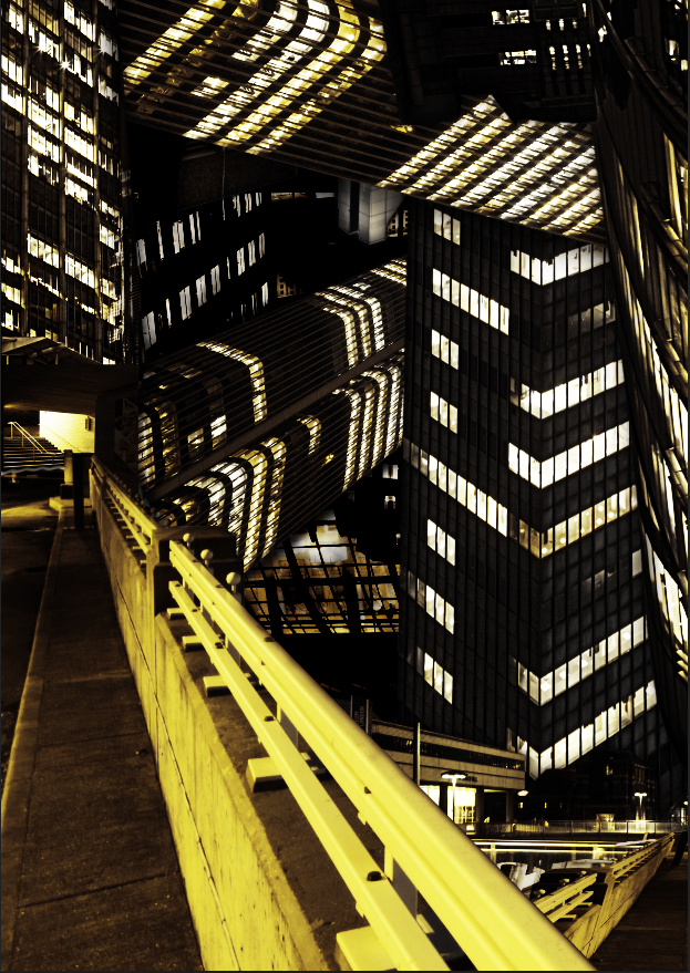
This is my final image, 'Existence Moebius'.
The concept of this project was both to marvel and reflect on the 'artificial', mans ability to construct his fantasy into his reality. A city is a complex manifestation of the fantasy made reality, each individual building marking the fantasy, or dream of an architect, made into reality, inhabited by thousands of individuals, of individual desires, cultures and diversity. The sheer scale of mans metropolis across the globe is in itself an unreal concept, and impossibility when one considers what we have created in such little time. None of this is natural, and it is entirely artificial, it is our creation, however the scale of our existence, our nature, and our construction, paradoxically means that the artificial is as natural as can be. Our fantasy is our reality, and as a species the diversity and scale of our fantasy is endless.
I wanted this reflected in my work, it an artificial piece, a work of construction, the art is shaped to every detail by the artist's design. It is my fantasy, yet it is made of reality, the scene I present to you is in essence a lie, it is my lie, yet is lies made of truth, and reflect the truth of our nature.
The construction of my image is intended to immerse and surround the viewer, much like if one where to stand amidst sky scrapers in the city, crane their neck in an attempt to look to their top. I worked with the notion of the corridor, from the work of Catherine Yass, in order to create a 3 dimensional space within my 2 dimensional canvas, where one can look down the street of my city of Moebius, in an attempt to find an end that is not there, look up to the buildings to find where man ends, and natures sky begins, yet it is not there. There is only the artificial, mans fantasy overlapping into reality.
This duplicitous existence applies to the nature of my image as well, upon first glance one can see only the city as a whole. This wondrous, impossible construction, yet if one approaches the canvas, to study in greater detail, one can see where buildings tilt on their axis at impossible angles, one can peer into the windows on the monolithic walls of this city to see the reality in it's interior, the banal office equipment, the scale of cabinet compared to the endless shrinking cityscape below. The fantasy overlapping into the reality, so that one can glimpse at the truth, the artificial is the natural, the reality is made of the fantasy.